Christmas at our House…and a DIY Holiday Highlights Party!

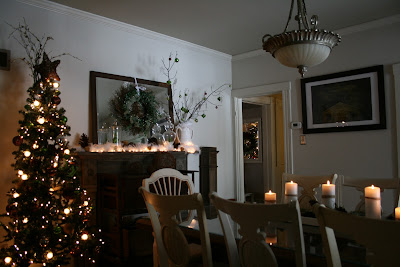
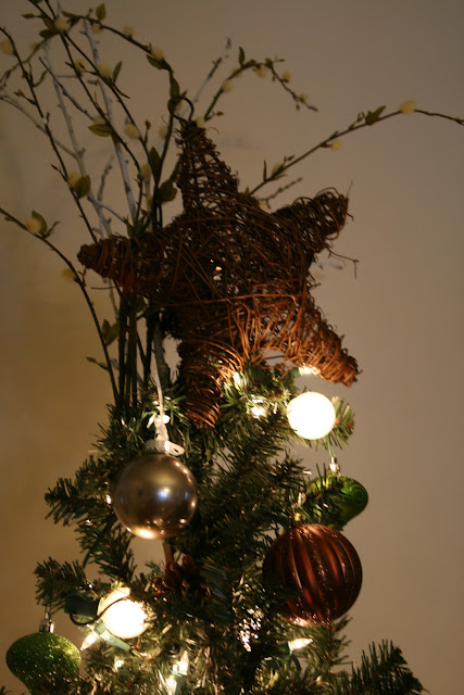
I love decorating for the holidays and here is a tour of what it looks like at our house this year…

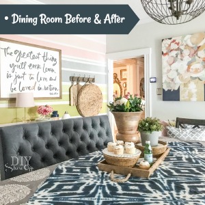
The dining room (there are still a few DIY projects ‘on the list’ like securing the mantel, hanging the door, painting the vent cover on the wall but see my before and after transformation at the DIY Club using Mythic paint, Dremel and my Purdy paintbrush!)

Here was that same doorway before:

Before:

After:  that dang vent is being camouflaged soon! I’ll also do a proper before and after/reveal soon.

When we bought the house…

This is how it looks today…


DIY Club

Now back to Christmas!

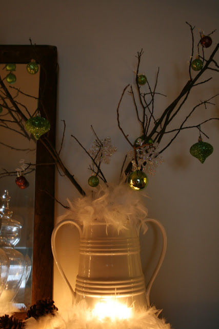
The apothecary jars with ornaments was inspired by Sarah at Th
rifty Decor Chick
 (thanks Sarah! I hope you don’t mind).  Okay, not just inspired but completely copied but they were PERFECT for my mantel too and if you can’t believe that your home decor is an inspiration and that copying is the best form of flattery…then we all wouldn’t be sharing, right?  That’s my story!  However, our similar holiday color combinations however are a complete coincidence! 
 
The living room in red and gold (same as previous years)…


The back entryway (with tomato-cage Christmas tree):

 
And just a little Christmas cheer in the kitchen because I’m crazy and decided that not only would I attack a dining room DIY-style, but I’d tackle a kitchen makeover during the holidays (or maybe it’s really just taking longer than anticipated.  Still!) …
 
I am happy to be linking to
Holiday Home tour at 


Hooked-on-Holiday-House-Tours
 
 
~*~*~*~
 
See ALL of the DIY Holiday Highlights party links for TONS of Christmas and holiday inspired decorating and DIY projects!


Please share your holiday posts below!

  1. You must use the button above (or html code on left side bar) and link to this post to share the linky love.
  2. Add your permalink (not your blog url, but your holiday project post url which is the web address that goes directly to your holiday project blog post, not your blog address). Feel free to link a Past Post, just invite your readers in a current post with a quick note.
  3. Or email your link to thediyshowoff@gmail.com and I will add it for you.
  4. If you notice your link has disappeared please check the content of your post. Is it holiday related? Add the link back to The DIY Show Off to your post today with a quick note to your readers about the party and try again! I love when everyone participates and readers check out everyone’s links, but I think the return favor of linking back is the nice thing to do so everyone plays fair and enjoys all of the projects and links. Links not related to DIY holiday projects or holiday decor for inspiration will be deleted. Please make sure you follow the above steps.

The Nest on the Hill

One of my most favorite things = old homes.  Not that I don’t love new homes!  Some days I’d trade old and drafty for new and energy efficient in a heart beat but being a DIY girl and owner of an old farmhouse, recycling and fixing up something already built is my passion.  So, imagine my excitement when I “met” blogger Shannon from The Nest on the Hill.  They are making their 1914 Victorian home theirs.  Since June, they’ve been DIY-crazy and doing a beautiful job.  Here are some before and afters!

Front porch, door and landscaping before

After

Hallway and Stairs Then
Hallway and Stairs Now
Living Room Then
Living Room Now
Dining Room Then
Dining Room Now
Master Bedroom Then
Master Bedroom Now
Upstairs Bathroom Then
Upstairs Bathroom Now

  • I love how fresh the front door area is with the new mailbox and how neat landscaping is now. It’s so welcoming!
  • Carpet on the stairs before 2, finished wooden stairs after 10!
  • Bare and no personality in the livingroom before.  Modern and comfortable after place to relax now!
  • Boring dining room to WOW! 
  • Master bedroom:  Plain Jane to Fun and Colorful! What a wonderful way to wake up everyday.
  • All white clean slate in the upstairs bath to oo-la-la spa.  Check out that tub now!
Shannon & Dan – you two are doing a super job!  Keep up the good work! I love seeing the progress and I think you have the perfect name for your blog.  The old Victorian is transforming into your Nest on the Hill!  A labor of love and the rewards are big! 

 ~*~*~*~

Stop back! I’ll be doing a CSN giveaway in honor of the DIY Show Off readers.  I appreciate you so much!  Your support when I started this blog about our DIY journey was so helpful.  Especially when we tend to look at what’s not done, you remind us to celebrate what we have done instead.  I love seeing your creativity and DIY projects.  You’re so talented!  You’re always so quick to offer comfort.  You worried right beside me about Niski when she was paralyzed and your prayers = miracle. She’s walking.  Your thoughts and prayers for peace for my dad and family through this sad time mean the world to us.  Since I can’t offer you an individual thank you gift, this giveaway is the best way I know to celebrate YOU.  Thank you from the bottom of our hearts.

Jones Design Company

Emily from Jones Design Company is a sort of new blogger and you’re going to get your DIY/decor fix when you meet her.  Her entire home is gorgeous and I’m so honored to share a peek with you but then you have to head over to her blog to check out more of her DIY and decorating talent.  Be prepared for lots of pictures, i.e. eye candy but I just couldn’t pare things down. 

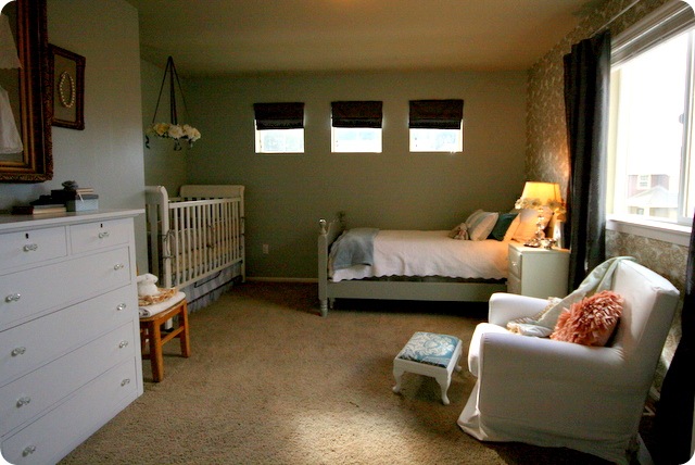
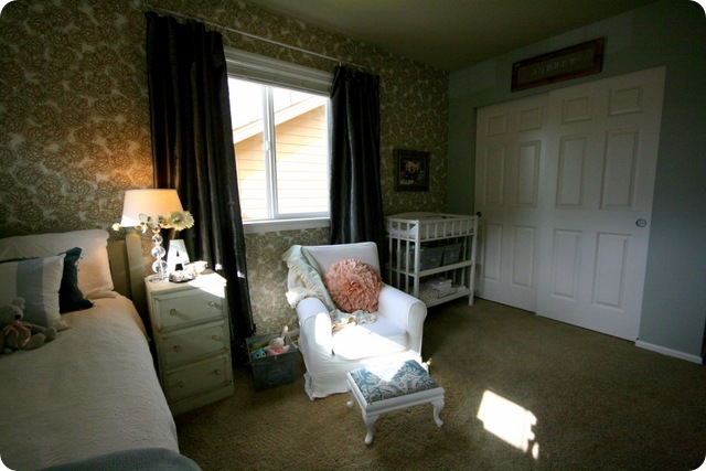
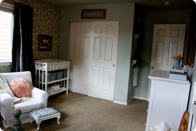
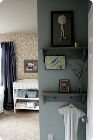
Here is her daughter’s nursery.  Love the soothing muted color scheme.  It’s so pretty and so comforting. And the vintage details make me want to live in this room.
My heart is happy every time I walk past Audrey’s nursery. The colors, the patterns, the fact that it is the girliest place in our house.  At first, when Ryan saw the color I was asking him to paint, he questioned me. Why blue? It was my one chance to go pink, and I chose blue.  I guess I’m just not as crazy about pink as I am blue. I’ve realized as I’ve spent time in her room, that if I could decorate my home any way I wished {without considering the four males that reside with me} it would look very much like our sweet Audrey’s room.
So let me welcome you to the nursery {beware, there are many photos!}
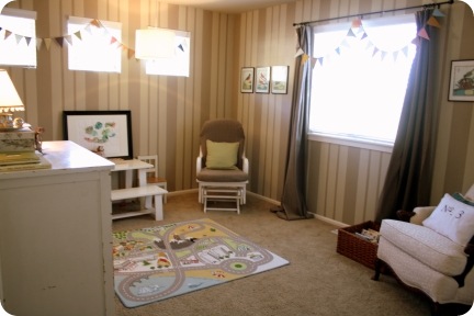
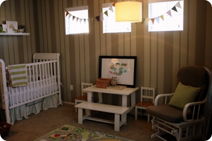
First, the before.
IMG_6006  windows
This was previously a boy’s nursery {go figure} and I loved the stripes. I originally wanted to use our guest room as the new nursery and us this room as the guest room so that I wouldn’t have to paint over the stripes, but that didn’t happen. So goodbye stripes.
And here it is now:
 IMG_1234
IMG_1287
IMG_1243  
IMG_1286
IMG_1289
 IMG_1284    IMG_1283   IMG_1293IMG_1296 IMG_1297IMG_1299IMG_1303
IMG_1290
IMG_1314IMG_1304
 IMG_1307IMG_1271IMG_1306  IMG_1328IMG_1308IMG_1310 IMG_1313  IMG_1316   IMG_1322  IMG_1326
We’re still missing a few key elements {a chandelier – I just haven’t found the right one; a large sheepskin rug; a canvas painted with her scripture verse on it; a few more pillows}, but it is as good as it will get for today. The rest will happen over time. I’m learning to be okay with that …
Some of my favorite things:
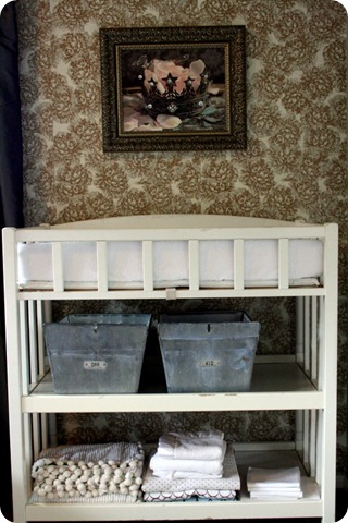
:: the wallpaper {actually flat sheets of gift wrap that I have adored for a long time}
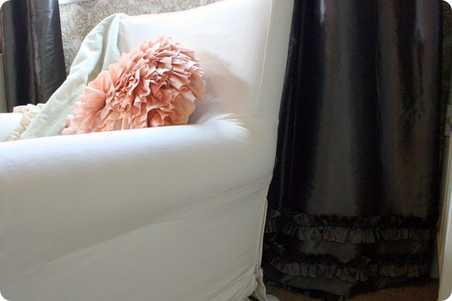
:: the ruffles on the curtains
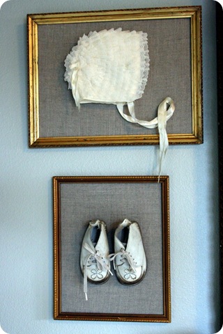
:: the old gold frames {from my grandparents’ collection. They passed before I really knew them, but I think we would have gotten along beautifully. Both were actors and artists – my grandfather did set designs for theater, my grandma taught acting classes to Judy Garland. My mom mentions often that I would have loved her home growing up – glamorous and eclectic at the same time.}
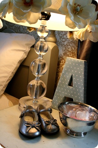
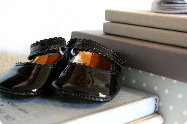
:: the vintage little dresses {I bought one before I was even married and the other was my mom’s}
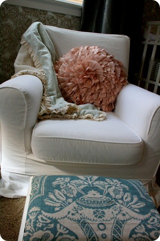
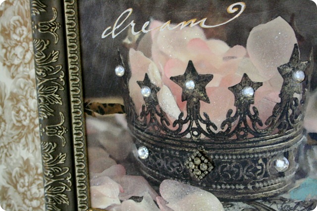
:: the pink ruffle pillow {I was not planning on putting pink into the room, but I found the pillow and then my mom gave me the crown artwork and it just came together.}
I really love all of the room. I was concerned that I had a vision that I wasn’t going to be able to translate into real life, but I think I got it pretty close.
IMG_0090

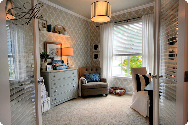
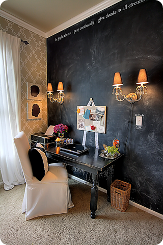
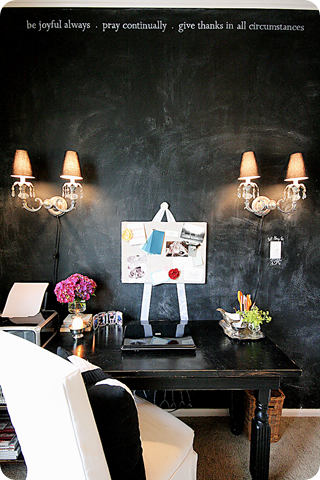
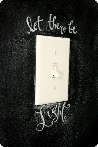
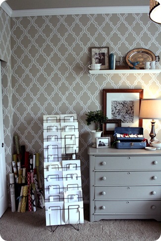
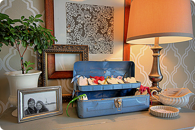
So, I wanted to live in the nursery but then I saw her amazing office transformation.  I just love Emily’s style.  Pretty, feminine details and the ‘painted wallpaper’ is stunning (tutorial HERE) and my office needs a chalkboard wall.
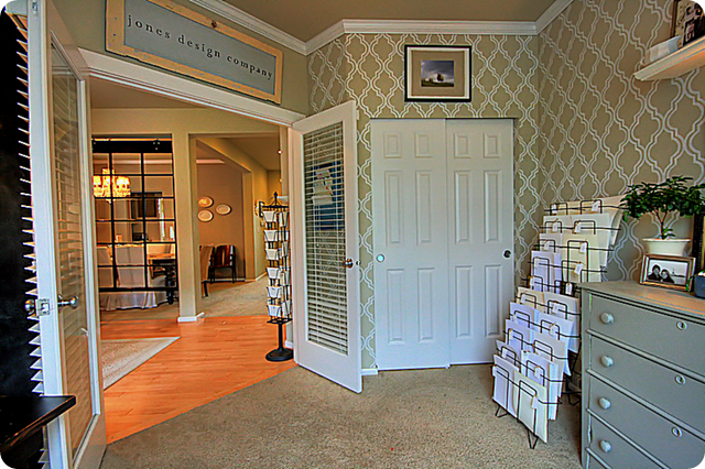
When you walk in the front of our home, to the right is this room.  It started as my office, then we switched it to be Ryan’s office, then a sitting room and now back to my office {can you tell we’re a little fickle about decorating?} 
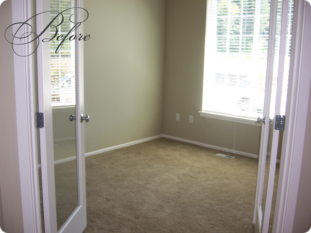
Anyway, here is the room when we first moved into our home.
office before     
And, after hours of painting and a little fluffing, here it is now.
officeentrynew
I wrote about the start of the project here & about the chalkboard wall here.
officedesk
desk
boysphoto
officebulletinboard
IMG_2436
wall
 dresser         
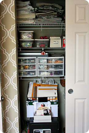
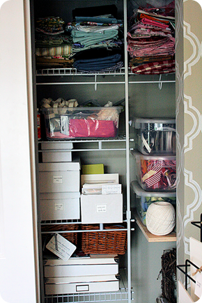
closet
closetleft   closetyourotherleft 
   IMG_4461 
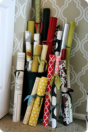
paperrolls  IMG_4454
The self-induced motivation seemed to do the trick {albeit a few hours late}.
One more then you’ll have to visit her at her blog for more decor magazine worthy living.  Her dining room is by far one of
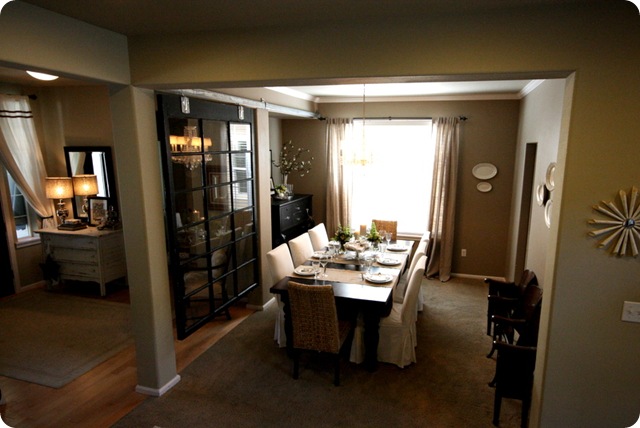
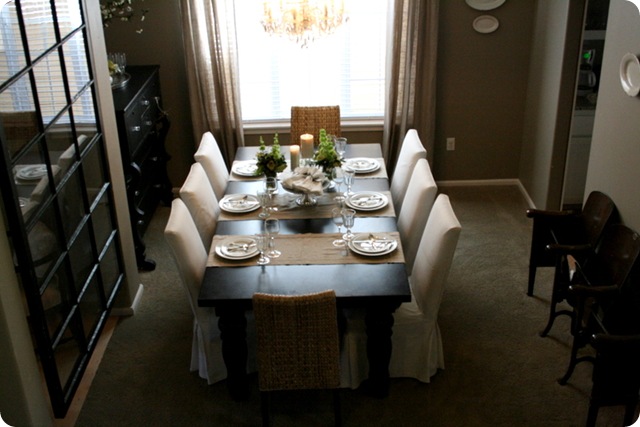
my favorites.  I agree with her.  Barn door tracks are so cool and we plan on using one for a French door in our dining room that leads to our office but now she has inspired me.  We have the perfect spot for a big beautiful window too.  I love the glam-country atmosphere in here:
The first room you see when you walk in our front door is the dining room.
IMG_3413
While we don’t use it often, it is such a luxury to have when we’re hosting a big party or holiday meal {in fact, my mom got engaged around this table at our Thanksgiving dinner last year!}
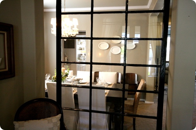
We had been wanting to do something to separate the space from the entry and when we saw this window at our favorite salvage shop, we knew it would be perfect {if not totally impractical}.
IMG_3418
Ryan hung it from barn door tracks so that we can slide it open if we need to {but mostly just because barn door tracks are cool}.
IMG_3416
Fortunately the boys have not paid much attention to the gigantic hanging single-paned window because old window + three rambunctious boys will never equal anything good.
 IMG_3396
IMG_3397
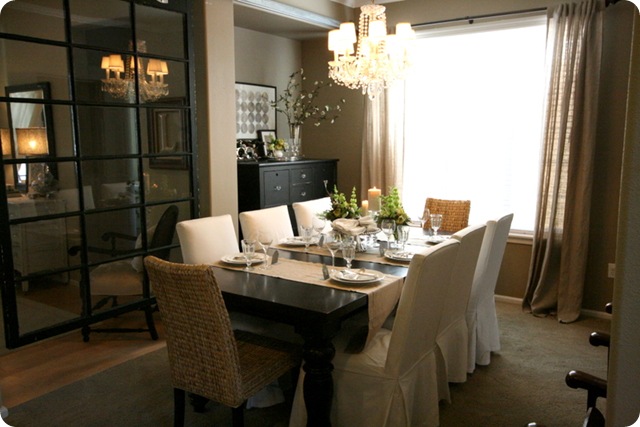
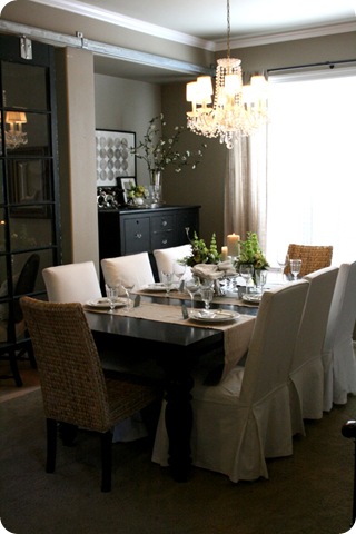
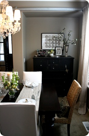
Our massive table {shown here without the leaves} is from Restoration Hardware {bought at the outlet store for a bargain}, the chairs are slipcovered Parsons from Ballard Designs and the seagrass chairs are from IKEA {although I don’t see them on the website so maybe they are discontinued}.
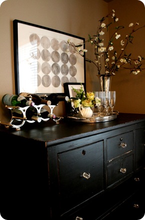
The big dresser {affectionately called ‘the black thing’} in the corner is one of my favorite pieces we have. It swallows our linens, napkins and serving pieces.
IMG_3392   IMG_3403
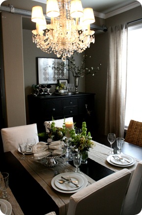
The chandelier is also one of my favorite things … crystally, sparkly and old. We took it from our old house and guess it is from the 1950’s {although now that I think about it, we really have no reason to think that. Regardless, it is great}.
IMG_3402   IMG_3407   
IMG_3391    IMG_3405 
IMG_3408   
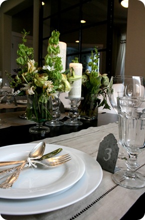
The table is all set … I think we need to have a party!

I almost don’t want to share this with you because it lessens my chances but she is having one amazing giveaway! 

Thanks Emily for sharing your gorgeous home!  I have to tell you that I am so inspired.  Your decorating talent is simply beautiful.