There’s more progress on the studio and the #helloredreno series. I need to get you caught up. I am a big lover of the power of paint. It’s such a game changer and a budget friendly one at that! There are so many possibilities. Dark and moody, fun and colorful, light and airy, neutral and soothing. Do you gravitate towards specific colors?
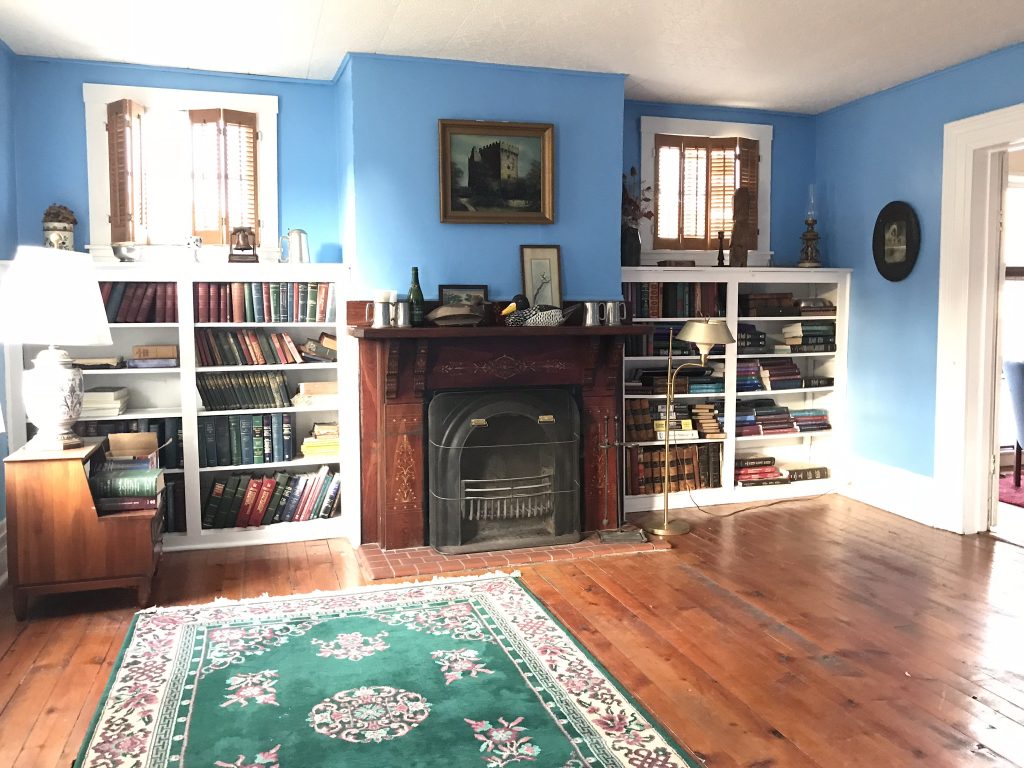
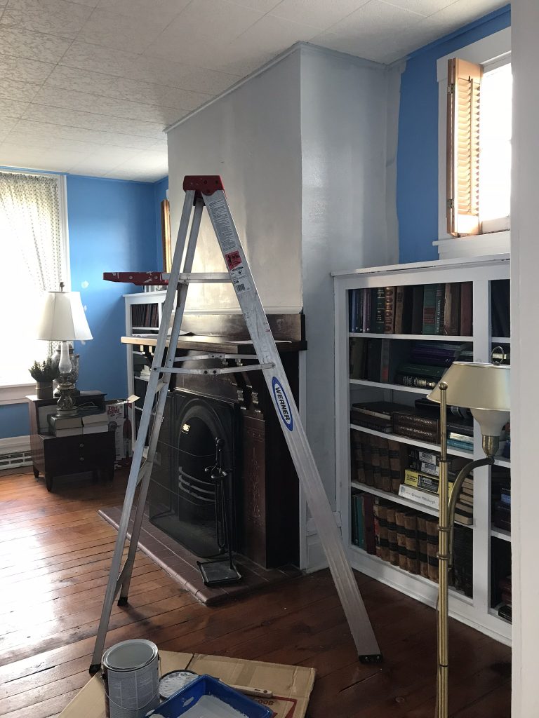
library/meeting room before…
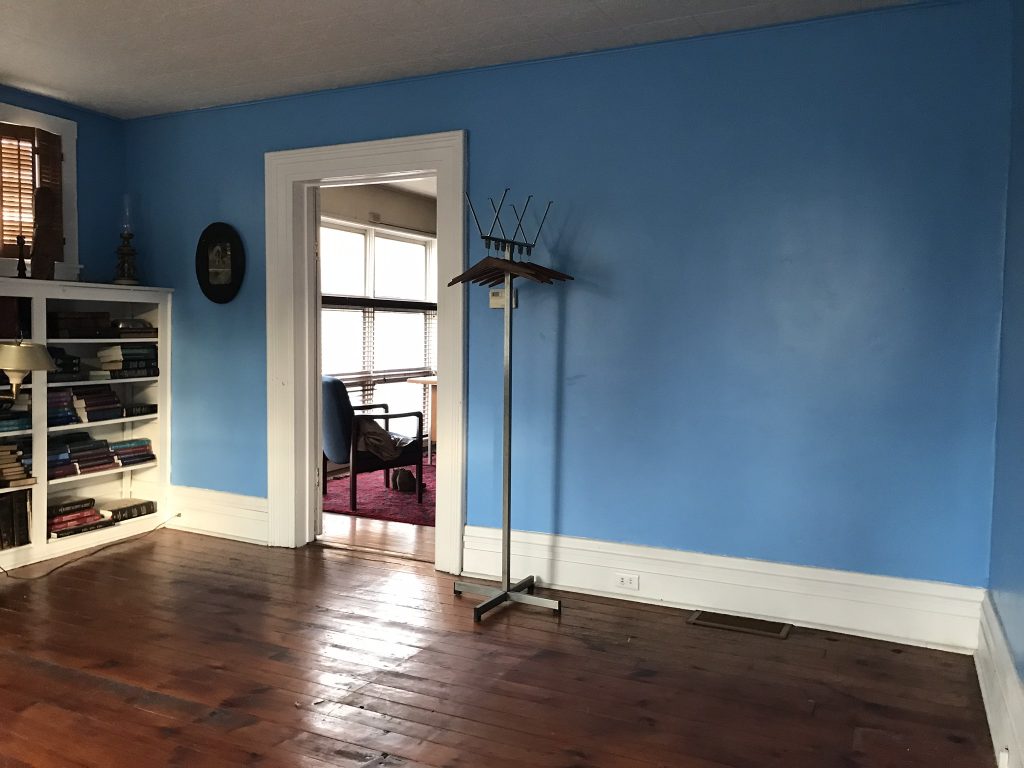
So this room. Oy. The color. Yikes. A bit on the aggressive side if you ask me. lol
Blue is one of my favorite colors but this shade is just so very…smurf-y. It’s just not my style. 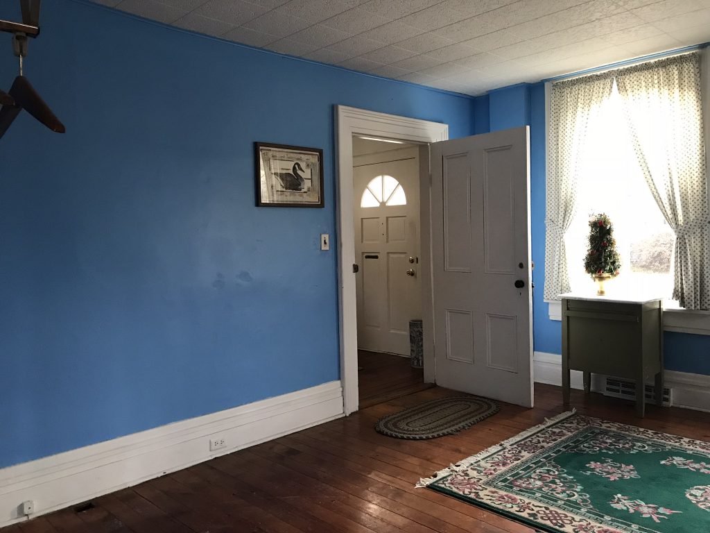
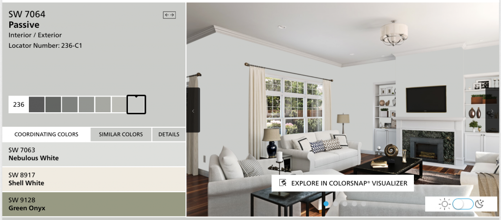
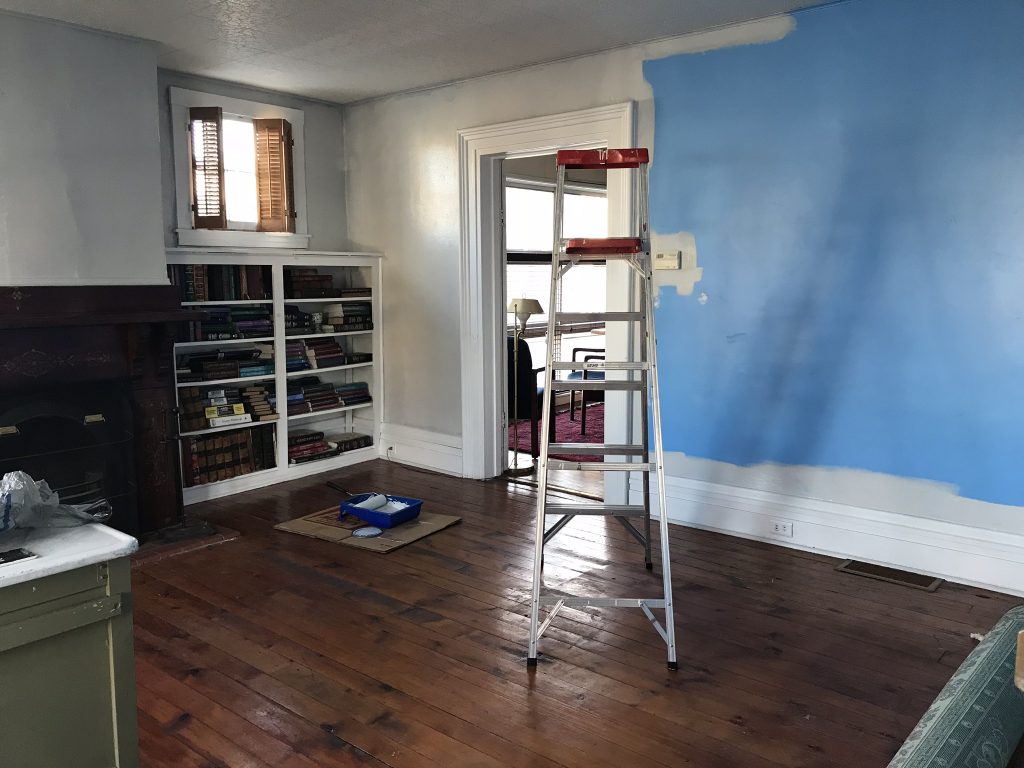
Perhaps that’s why this color called “Passive”, a pretty and neutral shade of gray from {HGTV} Sherwin Williams jumped out at me. I have painted walls in bright shades in the past and I’m a fan of accent walls, but for the most part, I prefer a neutral wall shade.
Because I like to decorate and redecorate so often. I’ve learned that I prefer a neutral back drop so that as my style changes or evolves, I can easily swap out decor and color schemes to fit my fickle choices.
It’s gonna take two coats to cover all of the blue but I’m already feeling soothed!
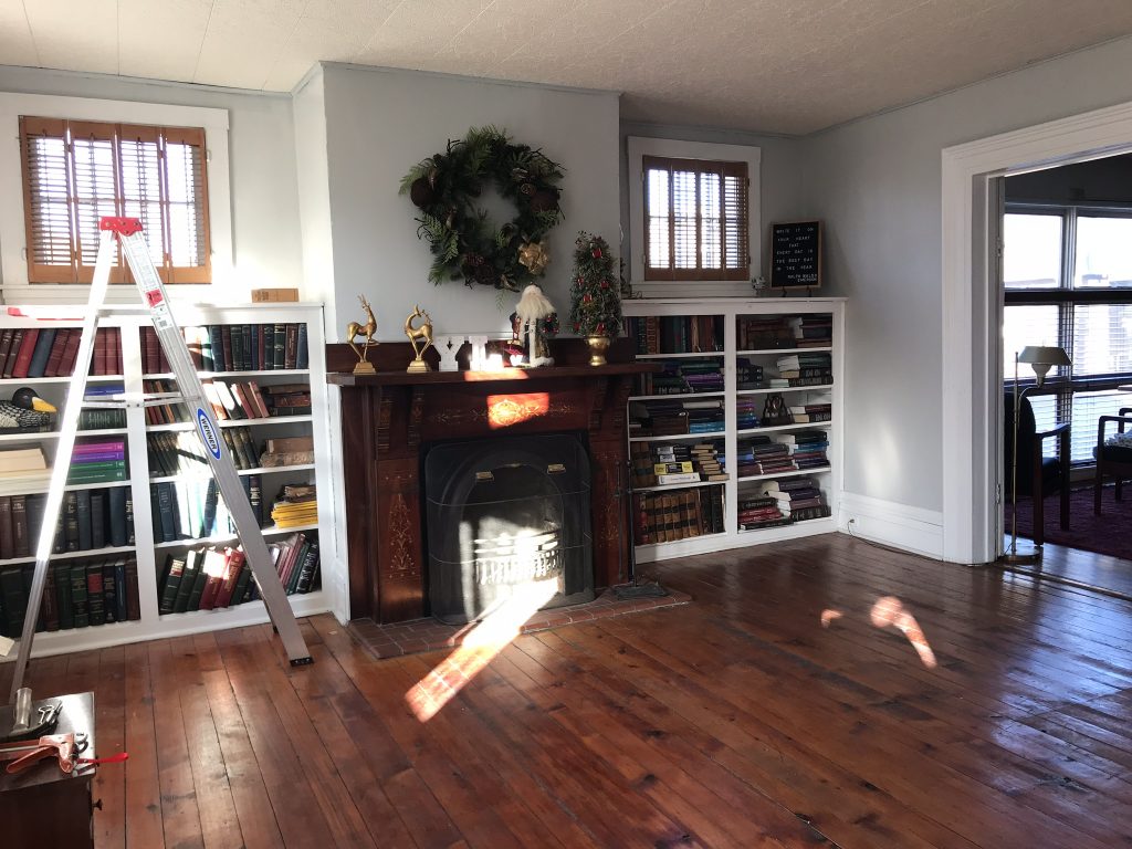
I even put up a few accessories previous owners left behind and what was in my car to help get an idea. Final thoughts? It’s definitely the right color for me. What a difference, right?
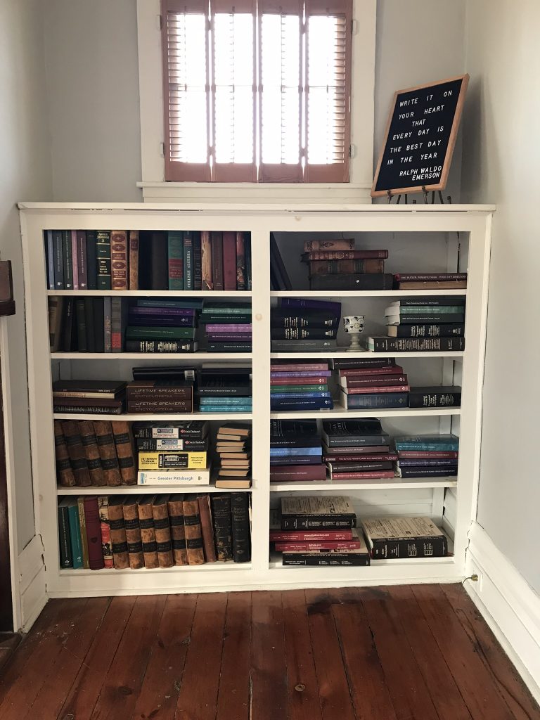
So pretty! Ugh, this last photo shows just how much work there is to do! I spy a lot of caulking in my near future. And book donating! Stay tuned for a design board and more progress. Follow #helloredreno


