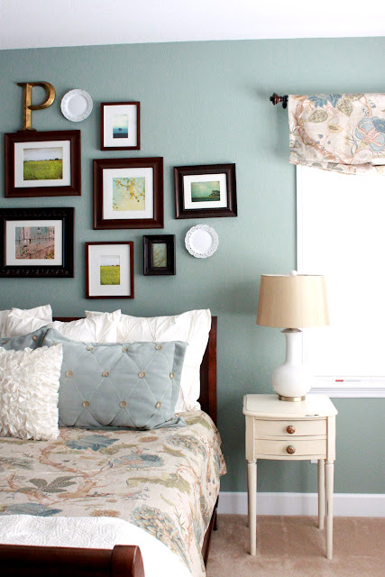
I wanted to use our existing bedroom furniture but give the room and bright and fresh makeover. It started with the duvet I found on sale at Horchow. I am sure they do longer have it it was last year when I got it. I purchased the duvet and standard shams from there. I added the white euro shams from West Elm and the ruffle pillow from Etsy. The white coverlet came from Homegoods.
Category Archives: Rooms
Kitchen Before and After
My kitchen reveal in reverse!
I just found some pictures from when we bought our house. I know you’ve seen the after shots but I thought you’d enjoy seeing a few before and ‘now’ pictures for comparison. This is one of the reasons I started blogging – watching the transformation of this old house and while I tend to see all that we have yet to do, these pictures are a reminder that we’ve come a long way, baby! Of course a really ugly before makes anything look like an improvement. So, even though our kitchen isn’t quite done, I have shared these after photos (there aren’t any super new ones) but it’s a reveal in reverse…before pictures to prove that we’ve made some changes. 🙂
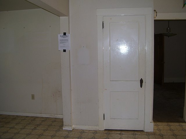
Warning: The before photos are very scary and a lot of ‘yuck’ from neglect/previous owners. Our home sat empty for awhile. A year or two maybe? I don’t remember. But it’s the location and size and character of this old house that won my heart…not the dirt and outdated/cheap finishes. I saw past the grime. I had a vision.
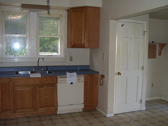
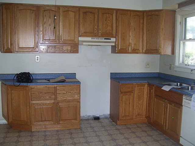
Kitchen before – it’s love at first sight, right? ha! love the Mr. Yuck stickers on the bottom cabinets, don’t you?
kitchen now
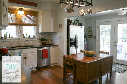
Kitchen before: that’s a ceiling fan pull cord hanging down.
Kitchen after…
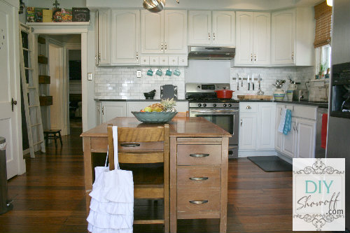
Kitchen before – what is that on the wall? I’m guessing the location of the previous owner’s kitchen garbage can? We don’t really want to know, do we?
kitchen now


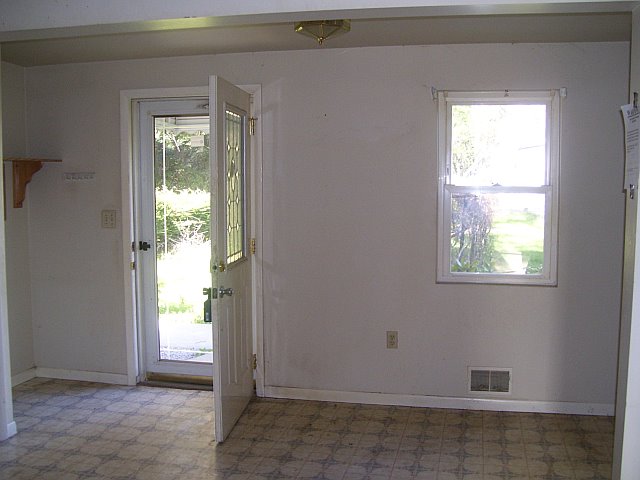
Kitchen before…I’m amazed how much smaller this door makes that wall look!
See the ugly sidewalk and rusty grape arbor in the background below? French door installation in progress:
Kitchen now…let there be light!

I know…these aren’t really “now” pictures as in “today”. They are at least six months ago before the move to WordPress as you can tell by the watermark. But, I did just return from Haven so you know my kitchen isn’t photography-worthy but thanks for looking – I was happy to find the before pictures!
{patio & grape arbor after too}

So, what do you think? A better idea of where we started and our home is a fixer upper for sure! If you haven’t already, you can see more in our home tour. 🙂
Now if only the upstairs bathrooms still didn’t look like the before pictures. I’m doubting it, but was your house move-in ready or did you have to work at cleaning some filth?


Happy to join the linky fun today at
Hating Martha, Loving Janel
Hello! Janel here from Hating Martha!
It is such an honor and privilege to be here.
Roeshel is the coolest. And her blog is pretty great too.
Oh wait…here is a picture of me. So you can picture me talking.
Yep, picture that while I share.
Okay, recently I shared about my Living Room’s jazzy new makeover.
I wanted to be sure to share it with Roeshel’s readers.
See, Roeshel has great style. And sometimes, sometimes when I
am in a decorating pickle I sneak on to her blog and look at her
house. Then copy it. Ha!! Don’t tell her.
See if you can see some hints of Roeshel in these pictures (the after ones…doh!)
I Spy Roeshel …
That coffee table I made from 2 wood pallets and a couple large tiles.
I “white washed” it with white spray paint for a beach look.
That area rug I made from 10 small rag rugs. It cost a grand total of $20.00. Crazy right!
The slipcovers I splurged on. I chose white for the sofa because my kids love to snuggle with the animals. I wanted to be able to bleach it if necessary.
All the pillow were made without sewing. Safety pins, beads, and fabric.
The corner gallery wall and nautical dresser were past projects.
Wooden pallet art, DIY octopus table, and painted IKEA chair are all past projects used for this makeover.
And my favorite…a buffet that was a lost cause, which I repainted.
I added vintage directions as wall art and some of my favorite pieces from my home.
Did you see Roeshel’s inspiration? Well, I hope so. Or I just paid her a terrible insult.
If you don’t like the new redo…Roeshel has no inspiration whatsoever!
I don’t know what you are talking about?
I used shades of cream, white, and grey whenever I was in doubt.
And, I used blue as the central accent color…in all shades.
Natural elements were used as much as possible for accessories.
I tried to copy Roeshel’s wonderful way of keeping history and style married together.
She does a great job of making a space feel “lived in” even if it was just, just decorated.
Well, if you liked what you saw stop by Hating Martha and say hi!
If you don’t like what you saw…hmmm…yeah, you can still stop by!


