Looooooong post today but I’m just bursting with excitement to share the amazing experience with you, my dear blog friends! If you’re like me, hearing about an awesome opportunity related to blogging when it’s my blog buddy just fills me with joy to no end! When I was invited to the all expense paid trip to participate in the Shaw Floors HGTV Home Design Challenge, I could barely contain my exclamation and hands in the air “YES!”. That noise that you thought was thunder last month? That was me jumping up and down! I’ve never had the opportunity to decorate a room from the floor up. My main experiences are extremely tight/non existent budgets in my own home.
Meet the Design Challenge bloggers:
Roeshel from The DIY Showoff
Cassity from Remodelaholic
Pam from Retro Renovation
Jill from Material Girls
Katy from Charles & Hudson
Julia from Casa Sugar
Rhoda from Southern Hospitality
Lindsay from Living with Lindsay
Carmen from The Decorating Diva
Ethan from One Project Closer
I loved meeting these talented bloggers! Some long time virtual friends, some new!
All super friendly and so talented!
 |
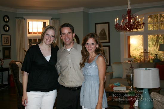
| Lisa LaPorta, Cassity from Remodelaholic, Roeshel from the DIY Show Off, Rhoda from Southern Hospitality, Lindsay from Living with Lindsay. |
Cassity and I have already shared a sneak peek of the reveal with you…


Now here’s the story of my intoxicating participation:
Last Tuesday I arrived at the Biltmore Inn. I could hardly keep my jaw from hitting the floor of the bus as we drove up through the front gate and along the beautifully landscaped drive. I imagined it must have been just the way Mrs. Vanderbilt felt the first time she arrived as she hadn’t seen it before her marriage to George Vanderbilt. Breathtaking and overwhelming beauty of the lush landscaping and stunning Smokey Mountains in the background.

My room at the inn was gorgeous…and there was a press package full of goodies awaiting my arrival.
After a long day of travel, nervousness and excitement, this bed was so inviting!
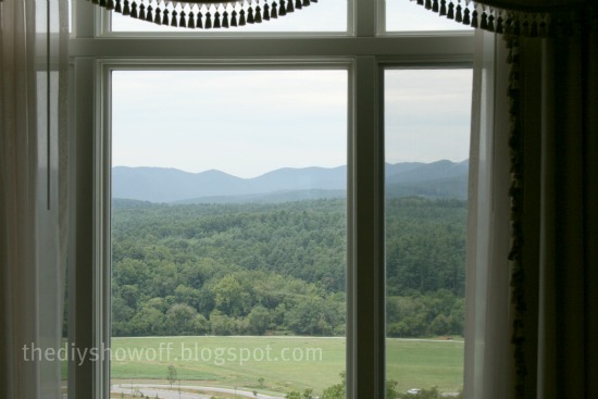
Check out my view of the estate and Smokey Mountains…
Later that evening, we attended a welcoming reception to meet the Shaw Floor team, the HGTV Home group and the bloggers as well as meet our design challenge partner face to face. I was thrilled to learn that my teammate was long time e-friend, Cassity from Remodelaholic! I’ve been a fan of her blog for quite some time and love her style. She is just as sweet in real life as her blog persona reflects. Love her!
(Not very many pictures this night…maybe when Shaw releases theirs. I had my camera but we were all just getting to know each other and I wasn’t comfortable snapping pictures. Did I mention that I’m shy?)
The Design Challenge: Design a room around a beautiful floor in the Shaw Floor’s new HGTV Home line.
The time came to be assigned a room (“bay”) and to pick our flooring ‘out of a hat’. Our room had a big picture window and board and batten. Great start! Just our style. Design fate was on our side when Cassity reached into the bag and chose “hardwood and area rug” for our flooring! Again – exactly what we would have chosen! We immediately decided to design a living room in our space. One that we ourselves would love to have in our home.
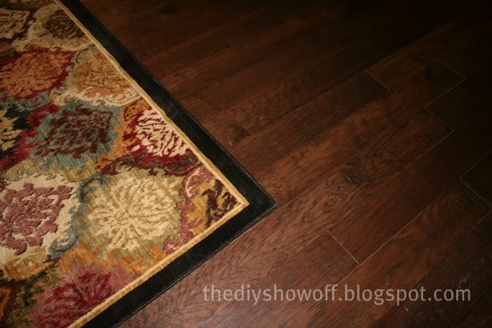
Hardwood (Rockbridge/Dusk) and Ikat Panel Area Rug
Our plan: A casual coastal cottage…sort of like this:
The Biltmore is a late 1890s mansion in Asheville, NC. We enjoyed a very interesting and informative guided candle lit tour. No expense was spared in this place. As you can tell from the picture, it is enormous! Every detail inside is over-the-top. I can’t even fathom having that much money ever, let alone over 100 years ago. Seriously? Who had an indoor lighted swimming pool, bowling alley, something like 43 bathrooms with indoor plumbing WITH hot and cold water, elevators, pool tables, granite, marble, picture frame molding and tapestries at every turn, fountains, 4 huge expansive floors of richly decorated rooms including an enormous library with spiral staircase? It’s all self-sustaining with a village full of shops, a dairy and a winery. I felt like royalty. We were treated like royalty too!
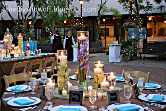
We then dined in a beautiful garden courtyard on the Biltmore Estate. I swear it was decorated by faeries with twinkle lights and gorgeous centerpieces. (As you can tell, my mind wasn’t exactly on camera settings! Oops!)
Look at the adorable place settings…I just love attention to detail, don’t you?We had fun talking, laughing and getting to know each other and eating delicious foods and desserts.
We headed back to our rooms to get a good night’s sleep for more surprises the next morning. While we were sleeping, our flooring was being installed by elves. Not really elves obviously…but it all felt so magical!
Wed. morning, we boarded a bus for a three hour drive to our next destination. While on the bus, each team was given a box full of magazines, fabric samples, little fun odds and ends, pictures of furniture and paint swatches along with our hardwood floor sample (handscraped maple) and a picture of the area rug we chose. Cassity and I learned that we share a love for the same style and that girl is so creative, she made our design board 3D! Putting together our design board was fun.
A chance for the inner kid to get creative with our passion for decorating and design. Cassity and I are both inspired by vintage, texture, neutral backgrounds with fun accents bringing in color, rustic woods and traditional pieces. We decided on a beautiful light blue as the wall color. We wanted accessories to pop in a cozy cottage atmosphere.
A chance for the inner kid to get creative with our passion for decorating and design. Cassity and I are both inspired by vintage, texture, neutral backgrounds with fun accents bringing in color, rustic woods and traditional pieces. We decided on a beautiful light blue as the wall color. We wanted accessories to pop in a cozy cottage atmosphere.
We arrived at Tribuzio Hilliard. TH is a commercial photo studio with movie set type bays (or rooms) with a warehouse full of furniture and every accessory imaginable from floor to ceiling. My first impression was complete ‘awe’. I felt like a little girl in a gigantic doll house. Talk about a dream come true!
And just like any good dream, things only got better when we were greeted by talented Lisa LaPorta of HGTV’s Designed to Sell! Oh my! Star struck for sure!

There were our own embroidered director’s chairs too! Isn’t that so thoughtful and awesome? Every detail of this event was just so personal and special. A girl could get used to this type of pampering!
Lisa was available for design tips, giving her opinions and advice and moral support and she was just darling overall. She is full of creative energy and a joy to be around. She played a huge part in making us feel comfortable, less nervous and as if we were stars too! We had so much fun getting acquainted with her. Of course we couldn’t help but ask for an autograph along the way.
 |
| Lisa LaPorta, Cassity (& Lydia) and Roeshel |
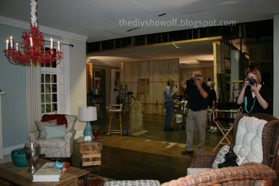
Here is our room the first time we saw it. The flooring had been installed the night before.
Before

“Shopping” was done in the warehouse full of photography props. So it wasn’t real shopping, at least not in a store. I can’t tell you where things were purchased. But hopefully the room inspires those seeking the same look on how to re-create a casual coastal atmosphere.
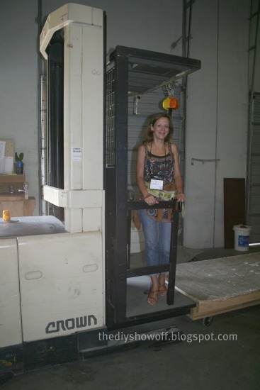
We began our shopping in the furniture and architectural accent (fireplaces, lighting and more) section. I even put on a safety belt and rode a hydraladder (or cherry picker) to view items stored near the ceiling!
Going up!
Every time we walked into this department, we spotted something new as if someone kept adding furniture when we weren’t looking or our furniture fairy godmother waved her magic wand and there was the piece we’d been looking for! It might have been that as things were removed by teams, more things were visible but I never had so much fun “shopping”!
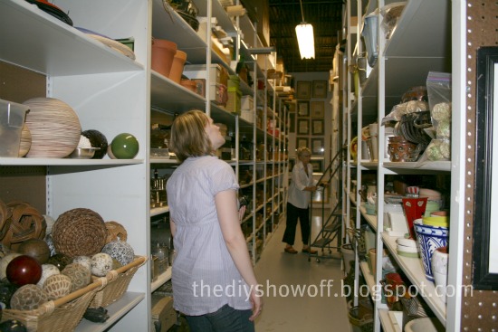
Other rooms had floor to ceiling sh
elving thrift-store-style packed full of goodies: lamps, vases, baskets, throw pillows, books, candles and holders, silk greenery, planters, fillers, clocks, statues, throws, bedding, mirrors, art work, dinnerware, glasses, curtains, fabrics, even food and drinks!
elving thrift-store-style packed full of goodies: lamps, vases, baskets, throw pillows, books, candles and holders, silk greenery, planters, fillers, clocks, statues, throws, bedding, mirrors, art work, dinnerware, glasses, curtains, fabrics, even food and drinks!
We eagerly filled a couple of carts with ideas and great accents. We then chose our accessories and even though the room wasn’t ready for staging, we couldn’t resist playing around and putting things together.
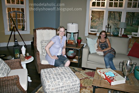 |
| Cassity and me – taking a break from playing with positioning furniture and decorating before room is painted. |
We even got to jump up into the back of a florist truck stuffed full of every type of beautiful fresh flower imaginable to choose whatever our heart desired for the room!
We then headed back to our hotel, the gorgeous Proximity Hotel and dined at the adjacent fabulous Print Works Bistro.

 |
| Social Lobby |
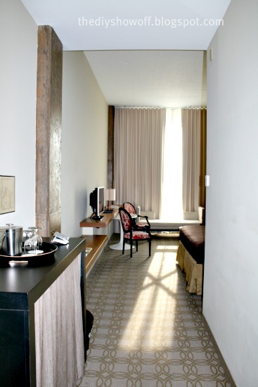
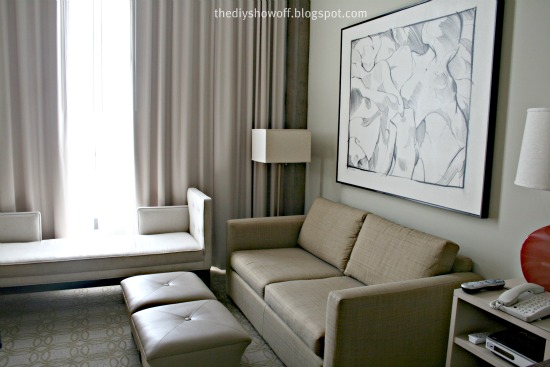
My hotel room was stunning. High ceilings, beautifully decorated and another amazing view.
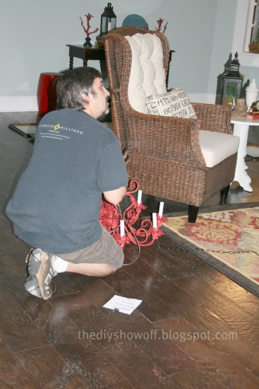
Our room at the studio, chandelier and some accessories were being painted while we slept. Wish we had those DIY elves in real life!
Bright and early on the last day, we headed back to Tribuzio Hilliard to complete our rooms. The paint was even more beautiful on the walls than on the swatch! Love it! We quickly got to accessorizing while our talented helpers hung the gallery wall art, installed the chandelier and helped with any little request along the way.
Thank you to our helpers!
This entire time, we had an amazing design assistant, Linda, who helped us along the way, searching for our decorative accents, working hard to make our vision become reality and pointing out professional photo things on our set that we wouldn’t have known about otherwise.
 |
| Cassity from Remodelaholic Linda S. Roeshel, The DIY Show Off |
Cassity has the sweetest baby girls who gave our room a big thumbs up too!
AREN’T THEY PRECIOUS?!
Once our room was completed, Cassity and I were interviewed on video by none other than Lisa LaPorta to discuss our design and our room! We were blushing with pride and from praise. I was a bit tongue tied. Cassity’s a natural in front of the camera. There was little time for prep and I always think of what I should have said or could’ve added after the fact AND if I had known about the video, I might have changed out of my casual attire for something prettier but I’m so excited to see that video!
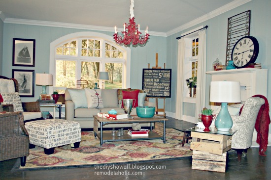
Here are some TONS of our after shots we took. We can’t wait to see the professional catalog-worthy looking photography of our design, hard work and pride and joy.
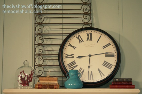
Mantel:
Here’s the wall you don’t see. Just like a movie set!
We went through all 5 rooms designed by 10 bloggers, 5 teams, each of us interviewed by Lisa LaPorta and I have to tell you…we’re up against some stiff competition! I don’t have a picture of it – I was being interviewed but the other bloggers listed above will be sharing their experiences and photos! Be sure to visit them for more details! Which brings me to the reason for the Design Challenge. All five rooms will be displayed on Shaw Floors’ Facebook page from September 1-30th where you will have a chance to vote every day for the entire month for your favorite room. We really need your support! There’s something in it for you too! More on that to come soon but don’t worry – I’ll remind you to get over there to vote and enter when the time comes.
So, that’s my fairy tale/dream come true story of the couple of days a DIY blogger got to play being a real designer. It’s something I never in a million years would have thought I’d get to do. Sure, I dream big just like everyone else and getting to do this, meeting my e-friends face to face and others who share my DIY passion as well as some pretty interesting and amazing people was just the highlight of the year.
A HUGE THANK YOU to Shaw Floors, HGTV Home and Empower (Hi Rachael, Hi Ashley, Hi Taylor!). And most of all, thank YOU my dear blog friends, because I know I would not have been invited it if weren’t for you and your amazing friendships! And I pray that each of you are presented with wonderful, dream come true opportunities one of these days too! 🙂
Thank you so much for sharing my excitement! Want to see more details? I promise you, you’ll see more of our room by my awesome partner, Cassity at REMODELAHOLIC and I’ll have something more to share with you coming soon!
Handy Man, Crafty Woman
Meet: Laurie from
She hosts a wicked awesome DIY party…




and she has some great DIY transformations too!
Before
Beautiful after…

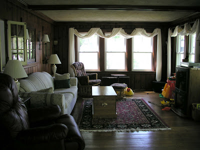
Living room before and after
Dark before…


Let there be light! I love the light walls and beautiful wood trim!

See more DIY from Laurie at

and link up to the Wicked Awesome Wednesday party!
Thanks so much for sharing your hard work Laurie (and handyman!). Great job!
Before and After at Oak Ridge Revival
Stunning before and after transformations!
Meet: Andrea, a self proclaimed design addict. Her before and after home transformations are amazing. Here are some sneak peeks. Click the links to see the full original post with more pictures and all of the details.
Kitchen and Dining Room Before
and now, after removing a wall, making one large room and changing spaces….
this is where the dining room was!
I love the white cabinets with the rich wood tones of the island.
and the dining room is where the kitchen was located in the first picture…
gorgeous!
the mudroom is right off of the kitchen…
I love when everything has it’s place (and it’s there!).
See more of this area of her home at The Heart of the Home.
A bedroom becomes a bathroom and if I didn’t see the in progress pictures, I wouldn’t believe it’s even the same house let alone the same room!
Bedroom before…
Ready? You won’t believe your eyes!
The same area is now a beautiful, spa-like retreat.
Rub your eyes. Look again. It’s still a beautiful dreamy bathroom!
Seriously, wouldn’t you love waking up and getting ready to start your day in here?

You’d find me here…getting all wrinkled…in a good way.

See the details at Bedroom to Bathroom.
The living room before actually looks pretty decent in the photo at first glance…
But, they removed the wallpaper, drop ceiling, poorly designed built-ins, old oak flooring, mantel, huge wood burning stove insert and everything else in the room. Literally. Makes the room sound terrible, doesn’t it?
They started fresh. As in this fresh….
Here is the amazing result.
A quiet space to read, play, chat and entertain away from the family room.
Reupholstered wingback chairs (fabric was $4 a yard!).
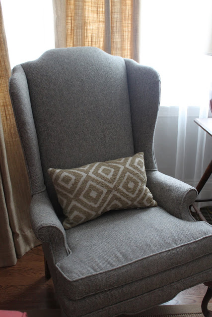
See more pictures and decor at Out With the Old.
Andrea, you’ve done a super job! The transformation is unbelieveable – it’s a completely new beautiful home. I love what you’ve done. I love your style. Thank you so much for inspiring us and sharing a bit of a home tour!


