Good Mood {board} – Living Room Edition
When I found out that “living rooms” were next up on the Good Mood Board event {blog friends sharing themed mood boards with a mood board linky finale}, I couldn’t wait to get started. Remember the last time when I put together a mood board for my guest bedroom and shared the reveal about a month later? A mood board is awesome motivation for giving your DIY plan direction.
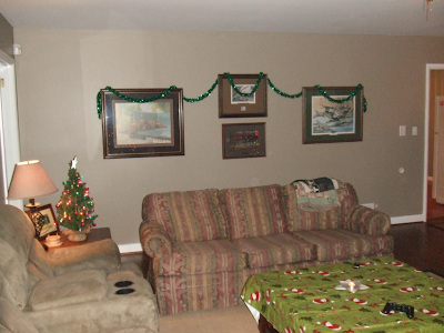
Well, this time, I’m doing a mood board for our family room. It’s a mess of a room right now with old mismatched furniture (not in a good mismatched way and not in a good “old” way – we’re talking hunter green striped couch with matching hunter green side tables…hellooooo 1990s!), walls in desperate need of paint, another plywood floor, windows with wood blinds but no drapes, huge potted plants and one ugly fish tank with one lonely gold fish that Mr. DIY refuses to part with (in fact he bought a fish tank 3x the size and it’s sitting empty along side the other in the family room at this time). I’m saving the ‘before’ until I have an actual ‘after’. Hoping that sometime early 2012 demolition and remodeling will take place.
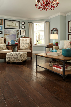
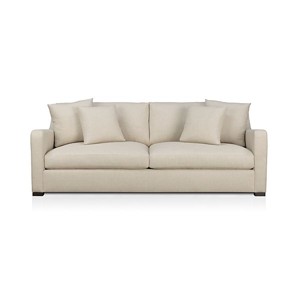
Anyway…Mr. DIY usually doesn’t offer up much in the way of preference when it comes to decorating but I think he’ll like this comfortable design. If I like it, he likes it. (He’s wonderful that way!) His only request is a ceiling fan. And of course the fish tank has to stay (gag!) but I’ll disregard that in my design today. It might look like I’m swapping out one mismatched room for another. lol But this is my starting point in terms of colors and overall style. A mood board for me is a visual starting point – colors/overall feel. It might not be literal in the sense of each piece (definitely not as some of the things are not in my budget) but it gives me an idea of where to start in terms of design. Paint choice, furniture, color, textures…
Neutral, Navy, Texture. I even decorated for Christmas…
It looks a little cluttered but I never ever claim to be a minimalist
(unless you count the one time when it comes to fish tanks). It’s so hard to fit all of the details on a little design board…there’s more space in real life. See something you like? You can see the details of my
olioboard here.
What I like is that with this design, I can add in more color with accessories.
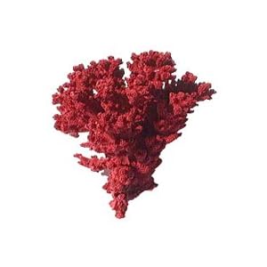
Pops of red
or yellow/mustard
or green/chartreuse
or orange/rust
or even pink/fuchsia if I was so inclined (and only if Mr. DIY became color blind) and it’d still look pretty.
Very versatile.
What do you think of my first rough draft? I love seeing if the real design will be anything like dream version.
Make sure you pop over to check out the next design in line from
Chris at Just a Girl …
Psst…get your holiday/color themed/paint projects ready for:

starts tomorrow 12/1!
