Do you have a finished game room/entertaining basement/man cave/kids’ playroom? If it’s something in your DIY future, be prepared to be inspired. Erin from Decor Allure just finished her basement makeover and it is a beautiful bright space that no one is ever gonna wanna leave! 1000 square feet of something-fun-for-everyone! Grab a napkin, you’re going to drool!
Here are some highlights from her reveal but visit her “
basement is finished” post to see the full details!
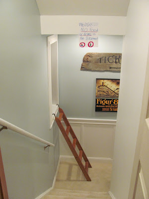
As you open the door to the basement this is what you see:
(No, the “no food” sign the kids made is not staying! It was just up for our annual New Year’s Eve Family Party. We had over 100 people and needed to keep the food to one level.)
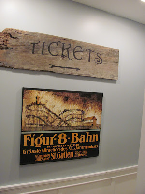
The landing half-way down:
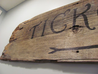
The vintage roller coaster poster I mod-podged onto a cheap canvas and the old wood tickets sign I made earlier (details here.)
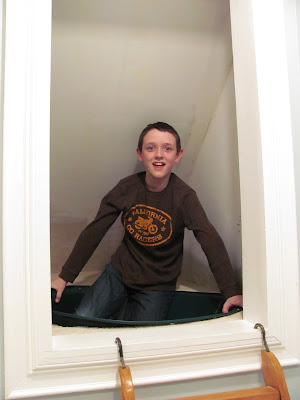
Are you asking about that Ladder about now? That ladder leads to my husband’s pet project and favorite part of the basement finishing. It leads to a tube slide down! Cool, huh?
My determined engineer husband twisted the top section and added an extension piece and made what I call “the death drop slide.” It’s very steep at the start, making it fast (perfect for our kids!) It does a zig-zag and comes out gently downstairs (you’ll see in a minute.)
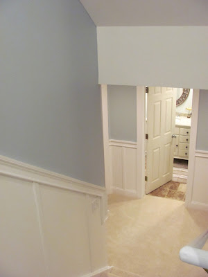
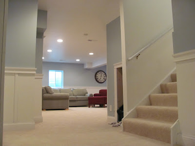
As you turn the corner of this landing, you can see down the next set of stairs to the actual basement.
Straight ahead it the bathroom, to the left are the two bedrooms and to your right the main room.
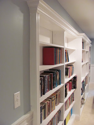
If you turn to your right, this is what you see:
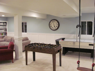
 We had a pipe that had to be soffited along this wall, so it made a perfect place for built-ins. I pulled out a bunch of pictures of what I thought would work and my husband built it!
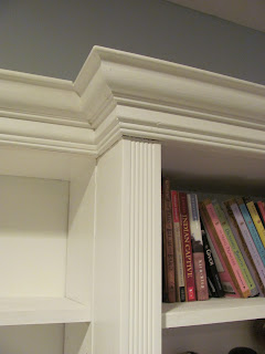
We found some lovely, wide crown moulding and some fluted trim at Habitat REstore.
Here you can see the almost-complete exit for the slide. We still have a bit of mudding to the trim area and touch up to complete that. We slanted the wall leading into the mai
n room to make a nice, wide entrance to the room. The door lends access to the slide and should someone want to remove the slide, it would be easily done and leave a nice storage closet behind.

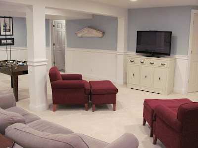
We threw down some furniture we had and I’ve since found the perfect smaller-sized sectional. I plan on slipcovering it and those red chairs with dropcloth.
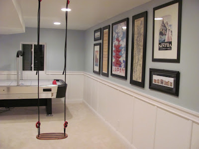
The kids also love the swing from Ikea. We reinforced some boards between beams and marked the spot before we drywalled the ceiling. The air hockey table was a $60 score at a garage sale a few years ago and the $10 foosball wasn’t out of reach either!
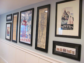
I pulled together a collection of posters, maps and prints from a few places we’ve traveled to. My handy-dandy mat cutter made it easy to use some old frames from Goodwill and a few standard, cheap frames to frame the artwork.
Here’s a close-up of the moulding treatment we chose.
Alright, this is heading back towards the stairs and the rooms.
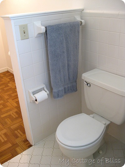
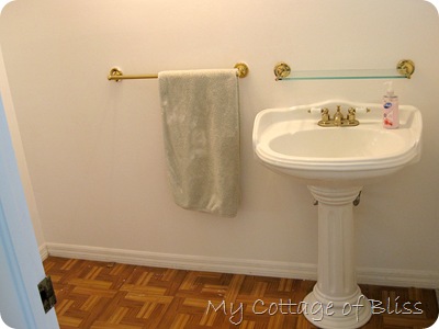
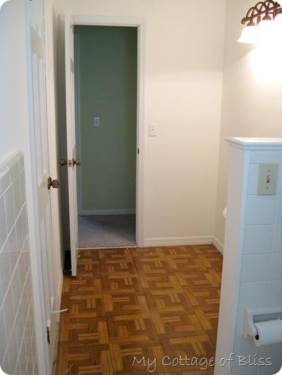
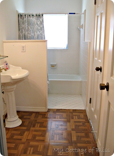
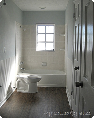
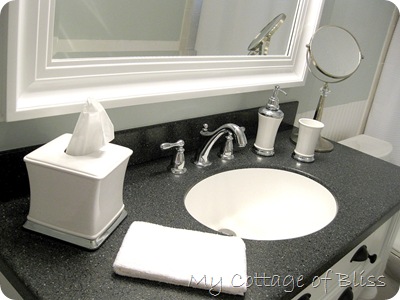
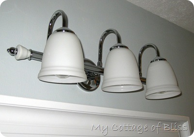
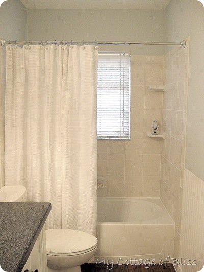
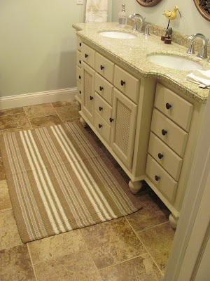
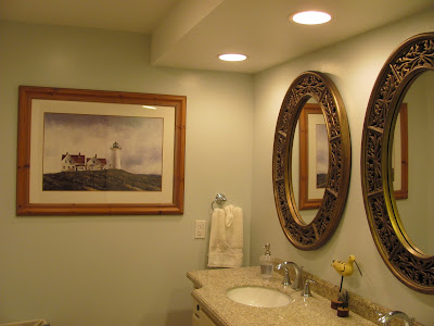
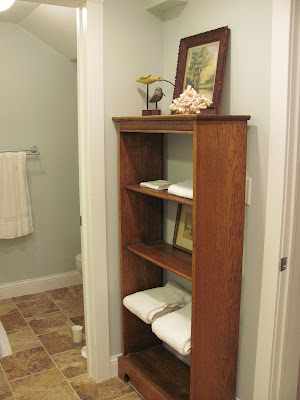
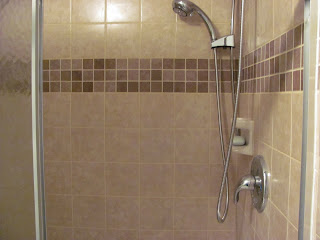
This is heading into the bathroom:
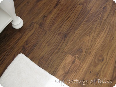
We chose to lay the typical square 12″ tiles off-set from each other instead of square to add more interest. We really like how it turned out.
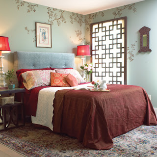
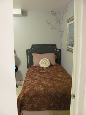
Now, we’ll head into the first of the bedrooms. My oldest wanted an Asian feel to the room. This was her inspiration picture that we were going for:
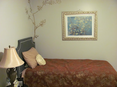
And here’s ours so far. We need some more accessories and such, but it’s off to a good start:
I made the upholstered headboard with nailhead trim (I’ll try to do a tutorial on it later) and made the bedspread. We already had the artwork by VanGogh and just repainted a second-hand frame.
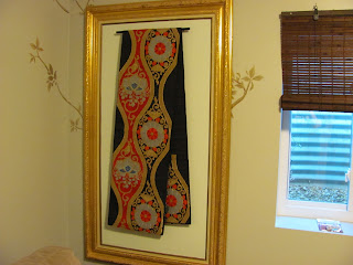
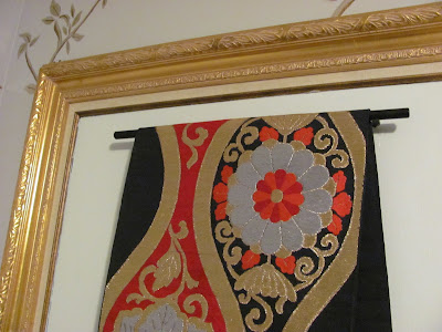
I found a very long $2 frame at a garage sale, cut a piece of thin plywood for the backing. After painting it, I screwed on a kitchen drawer pull and hung a Japanese Obi we had from our stay in Tokyo. It makes a fun art piece, yet does something much more practical; it hides the ugly electrical box that had to stay situated in the bedroom. It’s on hooks for quick removal should we need access to the circuits.
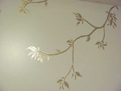
Some wonderfully talented friends came over and painted these branches for us in a nice metallic paint.
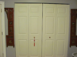
On either side of the closet we placed some old Chinese screen panels:
We’re on the lookout for a fun desk for her room, but it’s coming along.
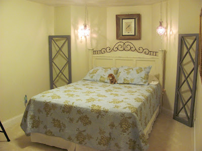
Next door is our other daughter’s room. She’s been warned that she’s the first to get kicked out when guests visit since we put a queen size bed in.
The headboard was found at a garage sale for $20, repainted the famous “Heirloom White” (we left off the footboard so it wouldn’t close in the room as much.) It’s positioned in a bow in the foundation since this room sits right under the den in the front of the house, which has a bow window.
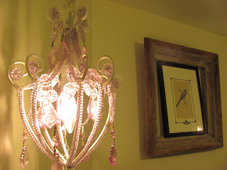
We already had these mini chandeliers from the girls’ old rooms. They have very dim bulbs so they can be used as reading lights. They’re connected together and put on a button switch attached low on the bed frame for easy on and off. This very old, delightfully rough frame was found for a $1 and the bird print in the center was found at Goodwill.
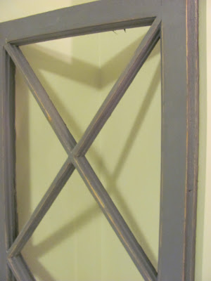
On either side of the bed are these great old window frames I found on Craigslist. We painted them gray and distressed them a bit. We’re patiently waiting for some free mirror on craigslist or Habitat REStore to turn them into mirrors. It’ll help reflect more light into the room.
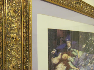
To the right of the bed is a sleeping beauty print we had in
their old room. The frame is a fun antique find for $5.
We’re moving in a slant-front desk and need to make some curtains, as well as look out for a few other accessories.
More pictures and details at her original post along with the paint colors she chose.
Erin – it is fabulous! What a beautiful and fun entertaining space! The bathroom is gorgeous – love the tile and fixtures. Lucky girls – such stunning rooms! I see lots of fun family and friend get-togethers at your house! Thanks for sharing all of your hard work. Super job!
