Val’s livingroom:
and her kitchen and dining area:
her stairway…

Val’s livingroom:
and her kitchen and dining area:
her stairway…
You can find see more at her blog, The Good Life for Less, but here is her post:
Case in point:
The kitchen. There are reasons you’ve never seen pictures of my kitchen (until now) on the blog.
Yes, I am sorry to burn your eye-balls with the ugliness. And lucky us, these lovely cabinets are featured not only in the kitchen, but two of our bathrooms and the laundry area (formerly). There is no doubt the cabinets were ugly. Ugly is the first, but not last thing they are. They also have (had) very weak shelving inside them, all which bowed under the weight of our dishes and they were a bad set up… they made the kitchen look so small.
We knew the minute we even looked at this house that the kitchen would need to be re-done. But our main concern was still being able to use the kitchen (we don’t have family near by where we could eat at in the meantime and doing dishes in the bathtub was NOT on my to-do list) and we didn’t have the money to do one big huge makeover (which can cost upwards of $20,000).
In “good life for less” form we finally came up with a plan that would be easy on the wallet and can be done in stages so that we can still use our kitchen (in a modified form) while work goes on and so we can pay all cash for the re-do. We don’t want to go in debt for home improvements when housing prices are falling in this area (still).
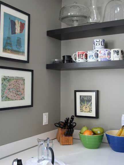
So today I can show you phase one! Yeah! We removed the upper cabinets, painted and fixed the holes in the walls and hung IKEA Lack shelves instead of cabinets.
 The OLD cabinets still are on the bottom… here they peek out.
 But it is amazing how the whole feel of the room (and the main floor, since we have a very open floor plan) feels completely different.
 The Paris artwork is all from an old calendar I saved… my husband and I honeymooned there, so Paris always has a special place in our heart.
 We especially love the framed Metro map… we spent hours studying it (and hours making fun of the silly names in an english accent).
 This basket I found at Target is meant to hold CD’s – FYI, it is also the perfect size for my Every Day Food mags which I LOVE. And I’m obsessed with gumballs lately. Don’t they make the perfect accent?
Total cost for this phase…
Shelves $120
Picture Frames $25
Phase Two will be ripping out the bottom cabinets and the island (it is useful but just doesn’t fit the floorplan of this house) and new sink/faucet/cabinets.

Stairway before and after…beautiful wood floors!
The back stairs were added after the fact and required constructing a wall in the garage thus incorporating one of the garage windows into the design of the stairwell. This resulted in a rather unique back hallway. Everything in the photo below was part of the garage originally.
Kitchen…I love the new cherry cabinets and fresh white trim!


Master bath remodel…a beautiful soothing remodel.
Before and after family room…so cozy. It looks bigger brighter. I’d love relaxing here!
Pretty guest bathroom transformation…love every detail!