Every once in a while, I meet a blog friend who not only shares my passion for do-it-yourself, but we share the same style and design ideas as well. Meet: Beth from
Discard that inspiring Pottery Barn inspiration and be prepared to replace it with an Unskinny Boppy rustic home office drool-worthy inspiration:
The goals for Beth’s home office were to 1.) Shop from her own house and try not to buy much. and 2.) Make it 100% “Beth”. She let herself run free with this room. Whatever she wanted to do, she did it.
Like a lot of us, Beth loves Pottery Barn’s rustic style. She wanted to incorporate a lot of that look into this room without the price tag. She did an amazing job working with what she already owned and a few new pieces too.
Beth had a blast designing a room filled with her collections, things that had personal meaning to her and reflected her style.
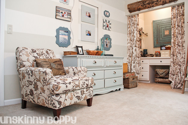
She started with a horizontal striped wall. A beautiful beginning point.
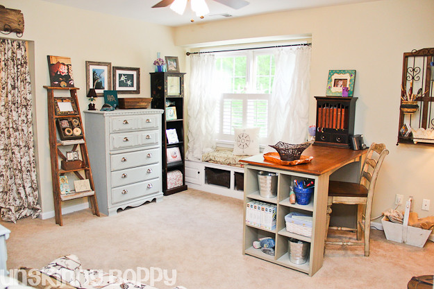
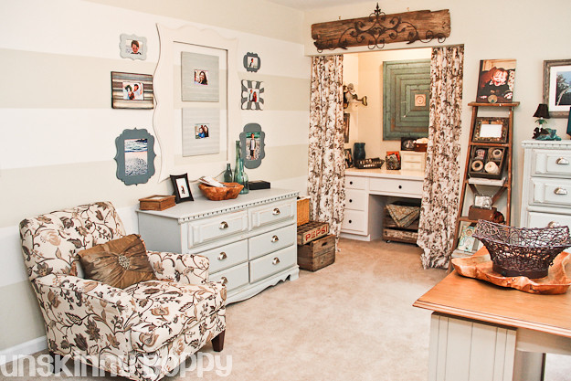
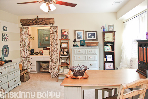
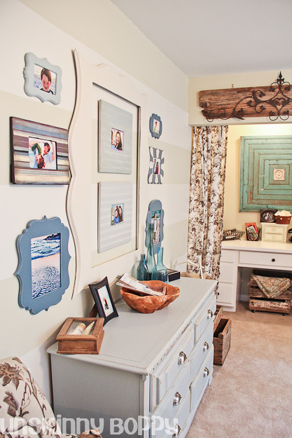
And here it is now! Lots of updates in a few months!
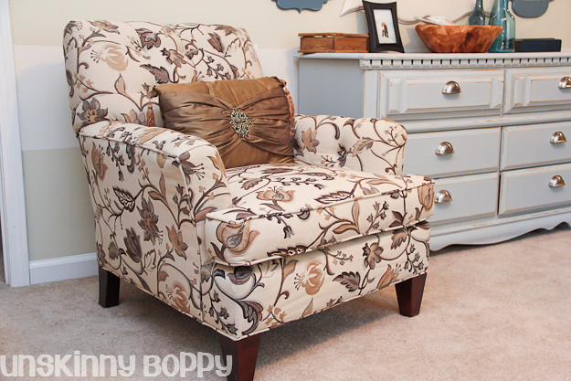
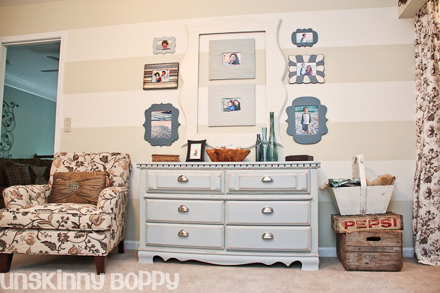
One of the few things that Beth purchased for this room was this pretty patterned chair at the Stacks Furniture going out of business sale.
There’s so many interesting details and she pulls it all together in a beautiful “after”. A pretty and creative work space – great motivation for more of Beth’s amazing projects!
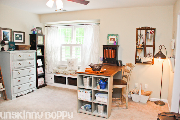
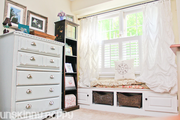
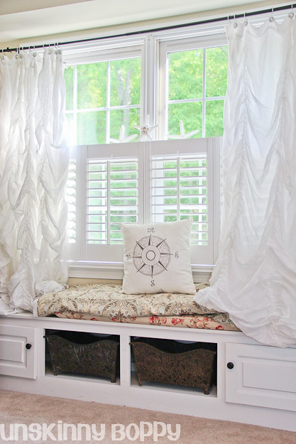
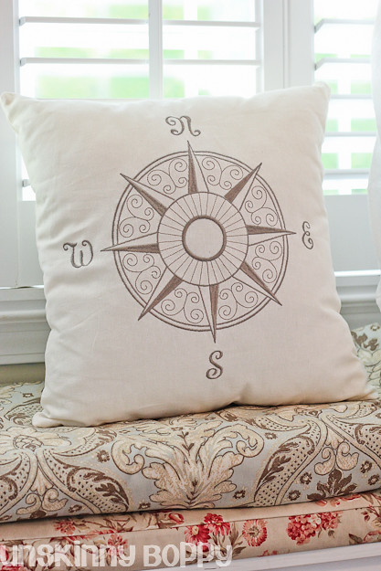
The window seat got a mini facelift with a new curtain rod, a new pillow and some starfish that Beth bought at the beach a few weeks back.
This would be one of my favorite places to daydream…
See the complete source list with MORE photos at Unskinny Boppy.
I love her attention to detail and personality…
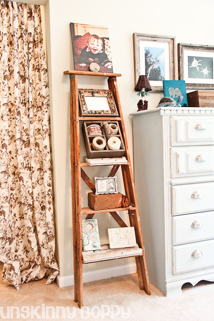
The old ladder came from Mr. Unskinny Boppy’s granny’s boathouse. It was his grandfather’s ladder for many years, and it’s got a plenty of beautiful wear and tear on it that I just love. It’s perfect for this room.
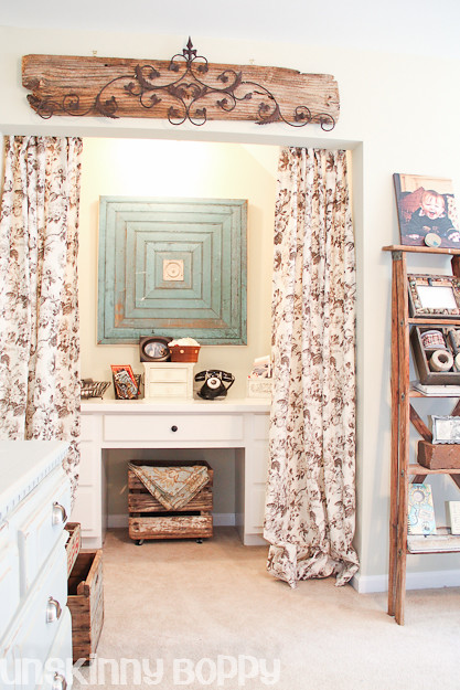
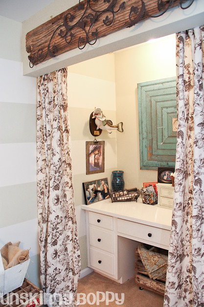
Here’s a peek behind one side of the curtains.
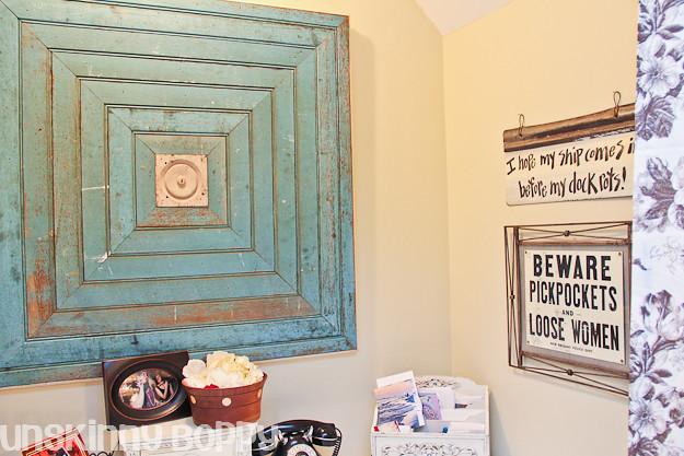
Beth loves to fish (it’s in her blood and she married into a fishing family) so this space is a perfect reflection of a mix of her interests.
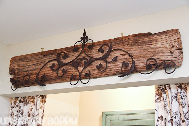
Beth added the scrolly iron plaque to the weathered wood for a less fru-fru look. Perfect!
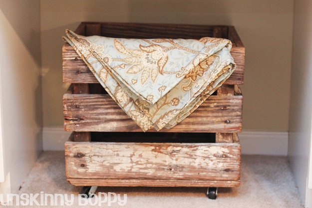
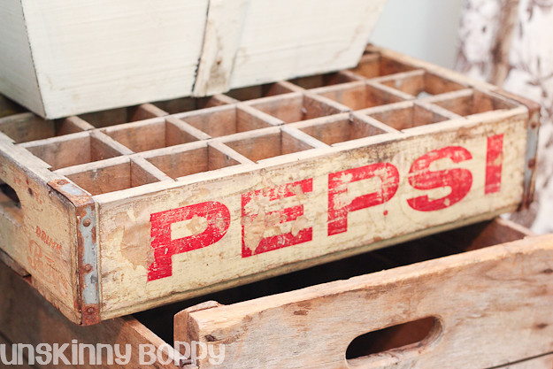
Vintage crates – there’s so much charm in this room, isn’t there?
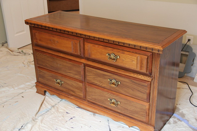
Dresser before:
Dresser after:
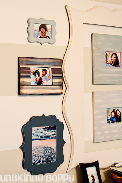
Love the collection of personal photos in fun frames!
This is just a small summary of so many awesome details in Beth’s home office transformation. Definitely check out more photos, projects and ideas {and pin from the original post} at Unskinny Boppy.
















Wow, she sure did do a fantastic job! Those curtains are beautiful and love how her bureau came out. Geez, there are so many beautiful spots in this room ! 🙂 I like the idea of the stripes. I am thinking about that for a room in my house and this post may have just sold me on the idea 🙂 Thanks for sharing and great job Beth!
What a fantastic space! The window seat looks so inviting, and I love the new chair! Thanks for sharing.
This space is fabulous – I could spend hours in that one room alone…!
Oh my goodness, thank SO much for all your kind words, Roeshel!
Day = MADE! I really appreciate the feature and all the great comments from your readers. This room makes me so happy. I’m glad I can be inspiring to you guys too! 🙂 Thanks again!
Beautiful! I love the colors and that ladder is fabulous. She did an amazing job of pulling it all together. What an amazing space to be creative in everyday!
Heather
Gorgeous! Every single detail! What color did you paint that dresser because it is delicious!
Hi Jennifer! Pop over to the original post at Unskinny Boppy (linked in the feature). I’m sure if you ask there, Beth will answer you right back. I didn’t see the color mentioned (except light blue) in her reveal. Thanks so much for stopping by! I agree – every single detail is my favorite. lol I can’t choose just one thing!
Hey Jennifer! That color is Beach Glass by Benjamin Moore. It’s beautiful!
What a great room! I’m heading over to Unskinny Boppy to go pin crazy. Thanks for sharing it
Such a beautiful space! I love how it looks like a comfortable space that belongs and fits in with the home, versus screaming “craft room” or “office space” … subtle and functional!
And Roeshel, I absolutely agree with you that this space would work perfectly in your very own home … I see your design aesthetic reflected in this space.
🙂
Linda
It’s lovely! She has such an eye for details and her fabric choices are so pretty!
What an awesome room re-do! I love the flower chair and the neutral striped walls!
It’s a gorgeous makeover and it’s wonderful how she has surrounded herself with so many personal items that hold true meaning.
The total effect is very welcoming and lovely. The small, personal touches are what make it truly special. I love the moldings, the picture frames, the repurposing of the dresser, the touches of rough wood to lessen the fru-fru and the ladder. Thanks so much for sharing with the detailed photos.
What a beautiful room!
Very cute