I thought I’d get the painting done in one day. I can usually knock out painting a room in 1/2 a day. WRONG! There is so much more cutting in and edging in our kitchen than a standard room. I am sore. But I’m also happy! One coat down. One to go.
I had the pleasure of trying True Value‘s Easy Care Platinum – Paint and Primer in One.
The True Value in Slippery Rock, PA has awesome customer service!
I was skeptical. I love my high priced paint and with redoing the kitchen, I was prepared to buy my favorite brand. It’s a kitchen – one important room where paint quality really matters. Mr. DIY’s domain (“D” stands for disastrous. BEST FOOD/BEST Messes.) But I figured I’d give it a try. It’s just paint and if I didn’t like it, I’d tell you and re-paint. However, I’m going to tell you that I was pleasantly surprised! For an affordable $27.99 a gallon – this paint is amazing!
Old color: Benjamin Moore “Palisades Park” eggshell finish (a pretty sage/pine color) but with the remodel, I wanted a completely new fresh look.
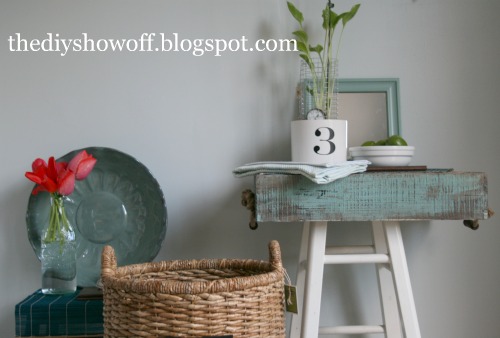
New color: Easy Care “Old Fashioned” satin finish (a light blue/gray that depending on the light, looks light blue-green or light blue-gray). I LOVE the new color. It looks beautiful with our newly painted cabinets, new Jet Mist granite and marble backsplash. It’s exactly what I wanted. It looked ‘white’ going on but dries darker to a beautiful shade of blue/gray.
Coverage? These pictures are just the one coat. I could get away with one coat and call it “done”. Except there are a few spots where I must have been stretching the paint thin and the green shows through brush strokes so I will do a second coat just for the sake of doing 2 coats/knowing it’s 100% perfect. Second coat goes faster than the first anyway, right?!
Isn’t it pretty? It’s perfect for showing off some reclaimed barnwood going in the room and our new distressed medium-tone bamboo floors (coming in June).
BEFORE
AFTER (Yes…small pantry closet is gone! So is the vinyl flooring!)
You can see the “Old Fashioned” wall color in the back ground of the pictures below. So, now I’m choosing the overall feel and accent colors. I have a farmhouse style. We’ve made up my mind but I’m curious to see what you think of the choices I created to choose from. Please vote below for your favorite! (Click here if you’re reading in your reader or email if you’re interested in voting.) I might be persuaded to change my mind. I’m indecisive like that.
Option 1 – Light Aqua/Blue & Green
Option 2 – Light Aqua/Red
Option 3 – BOTH! Combine it all!
Option 4 – Neither.
Something completely different.
Which would you choose?
Have you tried the Easy Care brand paint?
What do you think?
HAVE A WONDERFUL WEEKEND!












It looks great so far! I can't believe how well the paint covered the darker color with one coat! I love the idea of mixing option 1 & 2! I can't wait to see what you decide!
Roeshel, I am swooning over your kitchen! You know I love your granite and backsplash 🙂 The new color looks amazing!
I love the idea of mixing the two. I tried to vote but it didn't work for me, just thought I'd let you know 🙂
Thanks ladies! 🙂 Jena – I had to move it to the side bar. I just can't get the poll to work in the post. Thanks for letting me know!
R
I love the color! Cutting in is the worst! I like the aqua/green combo. For some reason I couldn't find the poll 🙂
Hi There, My wife and I are moving into our first home next month and I love some of the ideas you have on here. I personally like the aqua/green combo. They go together really nicely. Thanks for sharing.
Sorry Jenn. It's on the right side bar. ugh! I tried to put it in the post but no luck. I'll work on that again tomorrow. Leaving a comment counts! 🙂 Thanks so much for stopping by and voting!
ok, here is my thought… i love option one and instead of adding any red to that i would add some darker gray to tie in with your dining room, because aren't those cabinets in there gray? i think it would help it flow nicely.
I voted.
Cheri
Did you make your planter? It sort of looks like a canister I got from Target!
Mary
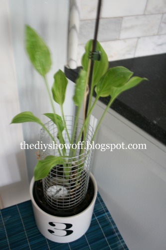
Hi Mary! The one with the #3? I actually got four of them in different sizes at the thrift store then added vinyl numbers on them. 🙂 No lids so probably not cannisters but love the shape! I bet they're pretty in your kitchen!
~*~*~
Thanks for the votes, blog friends!
new wall paint looks wonderful!
I might have missed it, but what color is your wood box, and the picutre frame?? Love it and would love to try it on some things.
as far as have I used the paint brand you did? no.
Do not quite understand how you do two coats of a combination primer/base coast. maybe I'm not getting it.
hope you will send box color info to me
blessing
barbara jean
We've been planning a kitchen redo, with nearly identical colors except with red as the accent color. I was worried that I would tire of it quickly, and looking at your aqua/green vs. aqua/red pictures, I am sure I am right. The green is something that would last longer, I think. What I plan to do is really stick to just the blue, and move accent pieces in all the time. I am also thinking of making reversible curtains… Good luck, and what a great post!
-Andrea
tablescapex3.blogspot.com
So very well paint covered the dark color. I like your blog. Truly something can be appreciate here.
dean graziosi
I like the new color! I can't wait to see what you decide. I voted for the 2nd option. Love that red against all the peaceful colors.
fyi – I have featured your whole site on our blog today.
http://tablescapex3.blogspot.com/2011/04/great-blog-finds-4_9129.html
If it was m kitchen I would opt for the blue/green accents because it's understated and very calming. The red is striking, but I don't want to be struck at 5:00 in the morning. I'm not what you'd call a morning person more like a mumbling person – until about 11:00A.M. Also our kitchen faces East and the sun pouring in the windows is striking enough. You didn't mention whether you're alert and cheerful in the morning or which direction it faces.
I LOVE the aqua/green. It's so fresh and pretty!
Barbara Jean – Thanks! Unfortunately – the wood box and the mirror frame were purchased just the way they are (the mirror at the thrift shop and the box at TJMaxx….so no suggestion on the color. However, I'll be on the 'look out' for something similar to paint/DIY my own accents and if I come up with a match, I'll keep you posted.
The paint and primer in one is just 1 can of paint that acts as a primer + paint. So no need to 'prime' two coats then paint two coats. Just paint. It really worked well.
Thanks for stopping by!
Thanks to 3 generations for the shout out! 🙂
Witknitter! haha. No, I'm not much of a morning person either but my husband is. The sun rises on that side of the house here too (WHEN it shines!). Good point to keep in mind. 😉 Thanks!
Roeshel
Your kitchen looks so great. I love the wall color. Very calming. I like both the green and the red with it, but I'd probably keep the red to very small pops of color. My mom once "accented" with red and it quickly over took the whole house. I kept telling her, "a little bit goes a long way, Mom." She was on a tear, though. lol. You have beautiful taste. I can't wait to see the final shots.
Looking good! I love the change and any of the accents looks good!
Debbie
Hi Roeshel, I love the color you chose, so pretty! I would have to go with the 1st option, the light aqua with the green, I think it has more of that 'farmhouse' feel to it. I think that would look so dreamy! Don't worry I did cast my vote 🙂 Can't wait to see what you decided on!
LMAO! i had to laugh cause i thought… is this me writing this?!? I have been putting off my kitchen because i just cant decide! Im in the middle of either Red or Green! I just cant decide! ok so heres the deal… you go both and I'll take all the hints and tricks that you can give me!
I've always liked a snap of red here and there, but with the beautiful aqua blue in this room, the red seems to jolt be out of the breeziness.
I LOVE options three!!! DO IT! 😀
-Ashley
http://www.DesignBuildLove.co
I vote either 2 or 3. I love the aqua and I'm neutral about the green, but I think the pops of red just make it!
I love the color blue/grey that you painted over the green (actually love the green as well) but I was wondering where you buy the Easy Care paint. Thanks!
Thanks, Ashley! Easy Care Platinum is a True Value brand, so True Value Hardware. You could probably also have it color-matched in another brand if there’s not a True Value local to you.