Our family room/kitchen went from this:

to this:
…and the view coming from the other direction went from this: to this:
The dining nook went from this: to this:
 (For more about that map, click here.)
And the family room took a lot of different looks before we really decided what we wanted. It went from this:
to this: to this:
 and finally to this:
 I had some of my favorite places printed up on canvases to add some color:
 (The top one is Wellesley College, middle is Bear Lake, and the last one is Utah.)
And you can read about the saga of making our family motto here.  Anyway, it’s finally done, and we love how bright and light it feels.
So, here’s the kitchen for now:

 Oh my word I love white cabinets.
Especially when they used to look like this: Room Change
(More to come but here’s a sneak peek):
It’s taken us a while to transform this: …into this:
Entryway
So, our entry way started like this:
Then we painted the door almost black way back when (this is the only picture I have for some reason): The “Love More” is just something I put up there because it has some special meaning in our family…and who doesn’t need a little reminder to “love more” once in a while?
After our “spruce-up” we ended up with this (although that archway is NOT blue…not sure why it looks like that):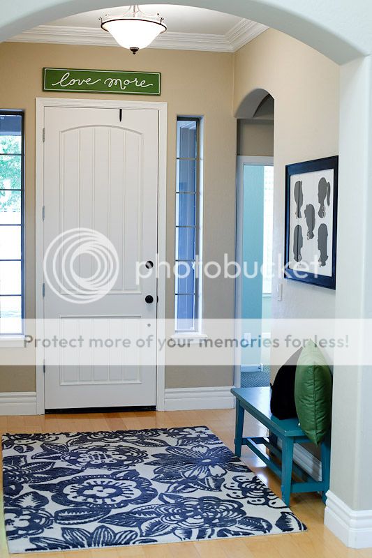
And here it is with a little of the dining room in there too…before I finished those window pane thingys:
My favorite part? (Aside from the fact that it’s bright and light and has that rug that I love sitting there for me to walk by all day long):
This thing: More details on the DIY art here!
Dining Room
This was our dining room a long time ago: It held no furniture for YEARS (but it was a great dance/gymnastics room).
Then we finally filled it up:
And spruced it up a little bit with this molding:
Here is the finished product from one angle:
And here it is from the other direction: (This is where we have Sunday dinner.)
That wall over yonder is my favorite part. Denise saw these old, rusty window panes at this antique shop and told me I needed them. She has vision. I do not. (I love her.)
Dave’s comment when he saw those heavy metal things was that we needed to make sure we were all caught up with our tetanus shots.
But I LOVE how they turned out.
Denise had the idea to put a bunch of dining stuff in each frame, but I could never find enough stuff, so I got foam core board cut to fit in each frame, covered each one with white coarse linen, and stuck in pictures of places we’ve been (you know how I salivate over traveling the world). 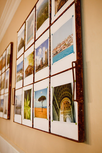 We like to talk about those places over Sunday dinner. And it means something to all of us.
Her “sprucing up” journey began HERE.
 Shawni – thank you! You and your family are such an inspiration. I don’t know where you find the time to fit in DIY or “sprucing up”! Thank you for showing off your gorgeous home and style and sharing your beautiful spirit through your inspiring blog and story.










Beautiful transformation! I love my white cabinets too! Great loving touches throughout your fabulous home! Thanks so much for sharing and congrats on a job so well done!
I want that kitchen! Everything is simply beautiful, thanks for sharing it us! Marcia
Such beautiful photos!! I even think the befores look great :), but do love the afters!
I enjoyed every minute of this post. You have a beeeautiful home! Thanks for sharing : ).
what a beautiful and creative home! I agree with Katie above though, it was beautiful before as well:)
That looks fantastic! I love that picture.
All I can say is Wow! So much work went into this transformation. I'm loving so many elements, but sometimes the simple things are my favorite like the canvases she had made.