First, do I have to apologize for tons of pictures? No? Good!
Our living room has been through a few changes in the last three years!
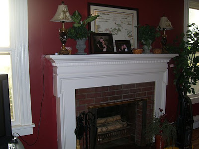
Here it is when we bought our home. Before, at time of closing: Lots of strange angled corners to work with.
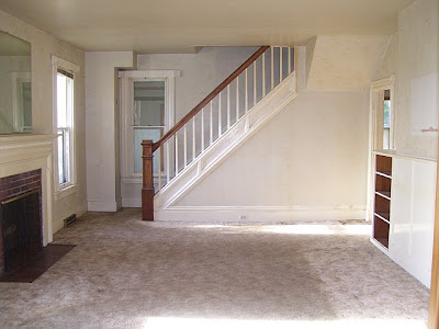
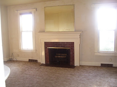
The white walls were painted wallpaper. Fun! We also tore out the nasty carpet and refinished the wood floors.
 Then, I always wanted a red room. So – I painted the room red. It wasn’t quite what I pictured but I really loved it for a little bit. Excuse the mess. Some of these I snapped right before I began painting.
 We mounted the tv above the fireplace…I’m not sure if you can tell, but there aren’t a lot of options (wall 1=staircase, wall 2 = entry to hall and built-in shelving, wall 3 = French doors, wall 4 window/fireplace/window). It’s really not too high for viewing. We’ve adjusted to it being there. Our wood burning fireplace isn’t used at this time (another future project). Since behind the fireplace is a brick chimney and the walls are plaster, I currently hide the wires with garland (upcoming project to build up the fireplace surround will take care of that problem). Brick? Someday we’ll replace it with marble and I got a dirty look when I suggested we paint it. Mr. DIY does not like painted brick.
Finally! Here it is today:


My thrift store find – wine corks.
Vintage French linen pillows – Restoration Hardware

French pediment – Ballard (I plan on adding more trim to the French door to fill in the gap) It’s weathered and says “Flanders Sweet Shop”
 Drapery is from Target and Ebay. I needed 8 + another to cut up and sew to lengthen them since I mounted my curtain rods near the ceiling. The curtains are ‘gray pebble’ by Thomas O’Brien. They aren’t a true gray, more of a griege color with a subtle pebble design. I got most of mine on clearance at Target so I don’t think they carry them anymore which is why I bought some panels on Ebay. I love the way they frame the French doors.
Wall art from vintageprintables.com (Here is the post if you’d like more information).
Featured at Ballard Designs:
“Pruvost Plaque” by Roeshel
I‘d love to know what you think!

This post is brought to you by Tiger Claw hidden deck fasteners – found at DIY Home Center your source for premium & unique products for your home, deck and patio area.













Great job! It looks so much bigger and brighter than when it was painted red. I love all the little french accents you have added around.
Beautiful!
Absolutely no apologise necessary, the more pictures the better!
I love the room in the lighter tones and you must be enjoying the fresh feeling it brings as you enjoy warmer Spring weather. It can't be an easy space to decorate and you have done a fabulous job!!
Angex
You definitely put in a lot of hard work and it shows. Great job!
WOW…what a difference! The room looks bright and airy, well done! I like the accessorizing you've done and the new curtains. Great before and after pics. Thanks for sharing! ~Liz
I definitely love the after, after! So cozy but bright – awesome job!
Kim @ http://frostmeblog.blogspot.com
party inspiration
Great job! The room looks great. I look for little things I can do and I think I am going to start collecting my wine corks and fill a decorative jar like the one in your thrift store photo. I better go buy some wine:-)
It looks amazing! And i know what you mean about red. I have loved red, but lately I need it in smaller doses…we painted our guest room red a year ago, and now…well, as soon as I can get our attic addition handled, it's going a pale shade of grey. 🙂 Thanks for sharing with us!
shaunna
I like this much better than the red. I love red though. The room looks so much brighter and bigger. Really like the furniture placement. Another great job!
Great color! Your room looks so much bigger. I also have design ADD–it's so hard to get it under control when you love it all! I think your living room has an interesting mix of styles and textures and could never be considered boring or cooking cutter and that is a good thing!
That's good to know about the TV above the fireplace–it's really the best place for ours but I'm hesitant to do it because I feel it's soooo high. We might have to give it a trail run one of these days.
****running arouend doing the happy dance**** Yay! I've been waiting for these pics for forever!!! The room is beautiful, Roeshel! I love seeing the transformation from when you closed until now. What a difference the light paint color makes. This room is way more in line with all your other room make-overs now. And the extra tall drapes are perfect. I love how you don't stick to one style (my problem as well)..it makes the room so much more interesting. I love all the little vignettes!!! You did an awesome job:)
Oh my gosh! It is gorgeous! I'm in a rush this morning, so I didn't get time to read everything, I'll be back later in the week!
Love, the new look!
gail
Oh my gosh! It's 100x better! It looks so relaxing! Now if I can just get the motivation to do that to mine….lol!
It looks beautiful! I love it! So refreshing!
The light wall color really gives your room a much more modern look. You really have put a lot of work into your home since moving in and it's really worth the effort.
What a transformation. Love the new lighter and brighter wall color. Great furniture arrangement and accessories. Love the wall of florals.
I love it, Roeshel! Love that taupe color you picked for the walls, too! It looks wonderful in the big picture, but I like to look at the little things, too. Like the pillows, the drapes, your pediment over the door. I think I just bought those same drapes from Target ~ the linen ones {$24.99 each}!
Lovely! It looks so chic and soothing. Very nice!
-Kim
That is a gorgeous paint color! I love the window treatments too. The new color makes it look like an entirely new space. As always, you did a fabulous job!
love it. Great job. It looks so relaxing and calming.
looks amazing.
Awesome, awesome job! Loving it all! Your curtains are amazing–can you share more info about them? What are they made out of? Who was this seller?!
I love your design scheme. Until you pointed out all the different elements, I didn't even notice it wasn't all one "theme." I just knew I loved the feel and flow of the room.
Great job!!
Amber was having a problem commenting. Testing to see if it works for me and here's Amber's comment:
Awesome, awesome job! Your curtains are beautiful! Can you share some more info with us? What are they made out of? Who is this seller (and do they have more)?!
I love the feel and flow of the room. Not once did I ever think (or notice) how many different "themes" you have going on. It's just gorgeous!
Great job!!
—
http://www.2nutsinashell.com
Thanks Amber! I will edit the post to include more information on the curtains. 🙂
Thanks ladies for making me feel better about my decorating mix!
~Roeshel
Love it! I especially love the color you chose. I think I might have to go out and pick up a chip to take a look at how that would work in my house. 🙂
Very nice work! I really love the new paint color and the way the room looks very put together. 🙂
I love it. It turned out amazing!
God's blessings,
Sarah 😀
Looks great! May you have many happy memories enjoying it!
Love it lighter and brighter! What a transformation. The beautiful wood railing and newel post really steal the spotlight now- as they should!
Great job, I adore the wall color and the vintage crates!
Great job, It´s better now. Silvia (Argentina)
I am all too familiar with stripping painted-over wallpaper. Your room looks so nice and big now! I agree that the red was too much. I'm wondering if I will get sick of my red dining room eventually, even though only the top half of the walls are red….very nice space!
GORGEOUS!!! This looks amazing, you guys did a super great job!!
~Morgan
Meet Virginia Crafts
Meet Virginia's Etsy Shop
It's just beautiful! Wonderful job!
Take care
Kristin
Great re do and I LOVE your design ADD….that means your style is YOUR style and not just homage to one era!
Hugs, Lana
Oh my gosh! Roeshel, I'm speechless. The LR looks amazing! Magazine-worthy for sure. I love everything about it, and honestly, I actually think that the sofas look brand new in the newly freshened room. You guys did such a great job. Well, probably more accurately, you did a great job!!
Miss you. I hope all is well.
XO*T
You've come a long way, baby. It looks great, from the draperies to your thrifty treasures…
New room looks designerish – very nice job !!!!!
The room looks wonderful. I love the color you chose for your walls. Love & blessings from NC!
It's beautiful. Hard to believe the before and after.. you've come a LONG way!
Love it! Love it! LOVE IT!
Great job and all the pictures are sooo great (no apologies!). Love the new smokey taupe over the red… good choice for a change! I enjoy you sharing your "vintage flea market finds", too. Thanks!
LOVE the fresh new look of this room. It seems so very YOU!
I just read the post on DTI and boy, what an amazing transformation! I think your home looks gorgeous, very light, clean and formal, but not stiff.. If you know what I mean? Thanks for sharing your beautiful home with us!!
Great job, Roeshel! Absolutely love the new wall color – it makes the room look so light and airy. The window treatments (love that you lengthened them and mounted the higher) with that pediment above the french doors are perfect too.
Those pictures could be in a home magazine are you kidding? The room looks amazing!
It is beautiful. Seriously! You have done so much work and it looks beautiful.
XOOX
Jen
It's beautiful, Roeshel! So light & airy! You did a fabulous job, thanks for sharing!
Hey Roeshel! I LOVE your living room makeover, the colors are beautiful!
Everything works so well together and it looks so cozy. Glad to see you're still having fun 🙂
I'll try to come around more often! 🙂
I love red, however, I am loving it gone in this room. Wow that new color made it look so different. Great job.
WOW! Your new room is just gorgeous! What a relaxing colour!
Come on over and link up at my Tuesday TALENT SHOW if you like 🙂
http://myhouseofgiggles.blogspot.com
That wall colour is perfect – very warm and cozy. I love how you took photos in all different lighting and the wall colour looks fab in all of them.
Great makeover!!! I love it. It makes your 90's couch look fab! Hugs, Cindy S
Wow, the room looks amazing, great job. I too have tried the red, I guess I am not too much on the primitive side. Have great day.
I LOVE your glass coffee table! Can anyone please tell mw where this is from???
Hi Karen! Believe it or not, I got my coffee table/end tables/etc. from Walmart.com.
🙂
Thanks for stopping by!
Roeshel
My family room has seen several changes too – seems like everyone is going from dark to light in their decor!! Should do a link-up of room "evolutions" haha….. here's mine:
http://bunsinarow.blogspot.com/2011/03/family-room-redo.html
Melissa
What a nice color. it really makes the room look bigger, and the doors and drapes are fab too. Overall, great makeover.
Beautiful!!
So bright and fresh!
Deborah xoox
Curious as to why you would not choose to put the TV over the built-in? I still not a fan of the crooning neck flat screen on the fireplace that I see in many homes. Room looks good though!
Hi Ann! For us, this worked best rather than have two focal points competing with each other. In the corner would be the best location, but furniture arrangement would be awkward. It’s been this way for a few years right now and no neck crooning issues. We’re far enough back when watching tv. Over the built-ins is a great idea too but there is little electrical on that side of the room and it’s outdated. It’s a more involved project but something I’ll consider when we have more money in the budget. Ideally, above the wainscoting between the built-ins would be perfect since it’s in the center but behind that wall is an old non-working brick chimney so again – lots of work and expense to make it happen but perhaps one of these days when we’ve completed some other big projects. Plus my husband wants to ad a fireplace insert and then there again, there are two competing focal points without enough space to make opposite walls work. Ugh. I love old houses but no one had to consider tv placement when they built this place and it does present some challenges! Thanks for stopping by!